Typefaces
[01] Klinger–Type Type–Design 2020
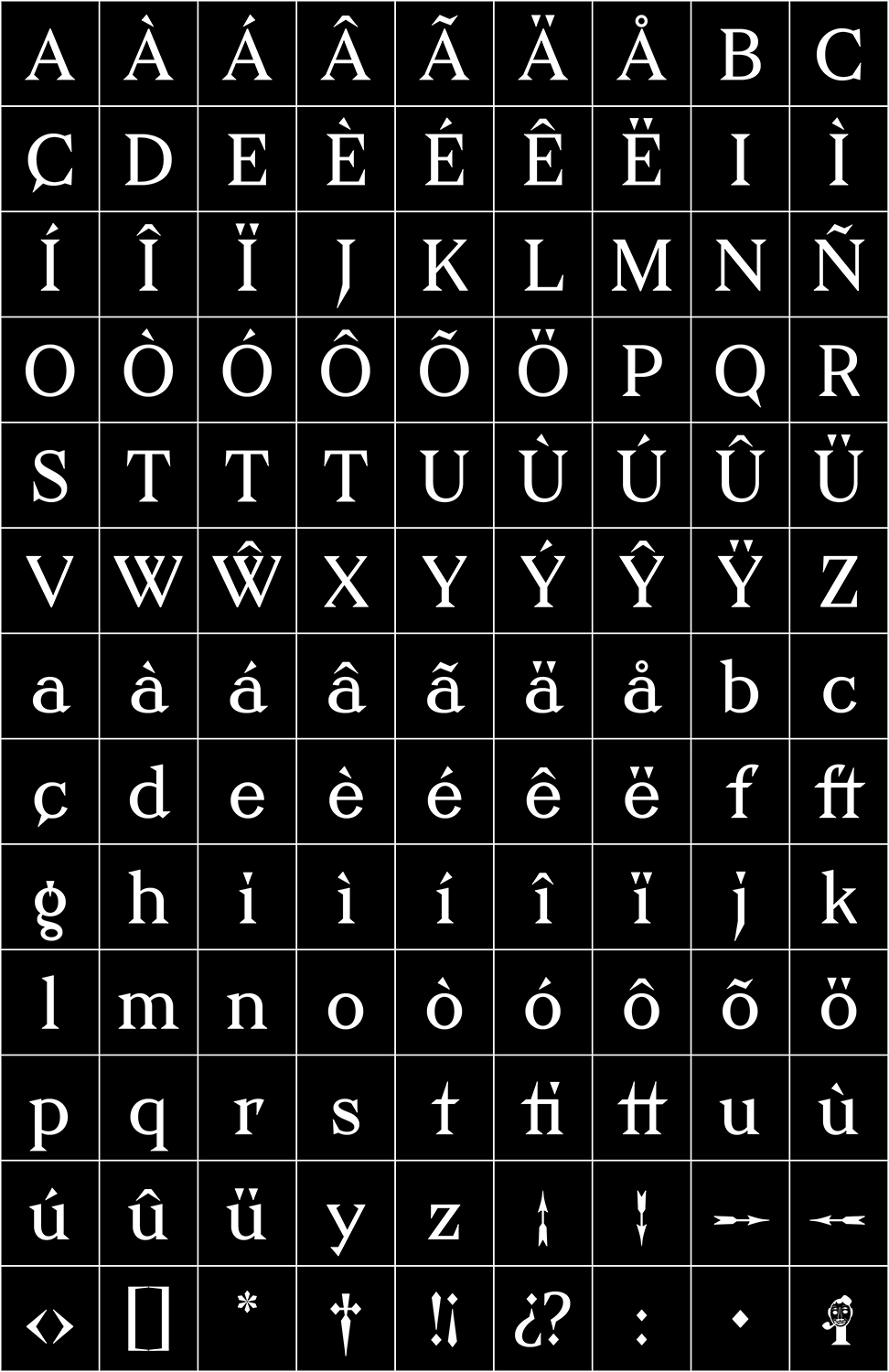

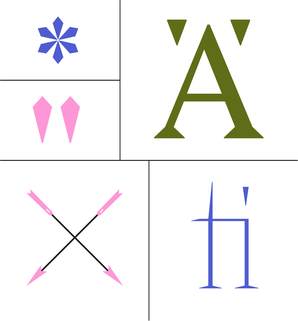

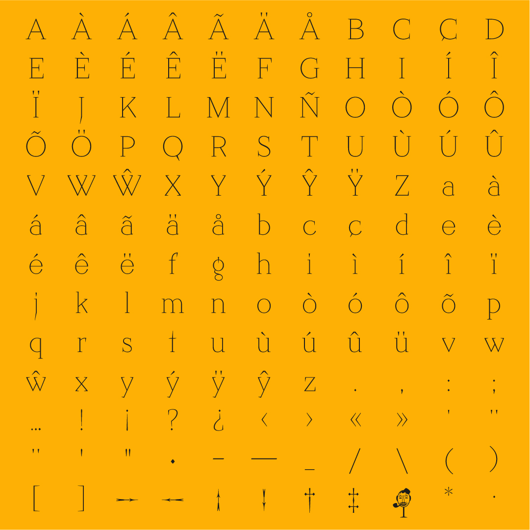


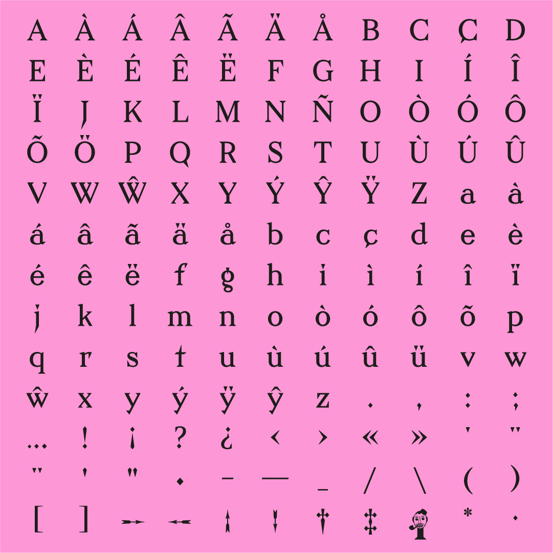


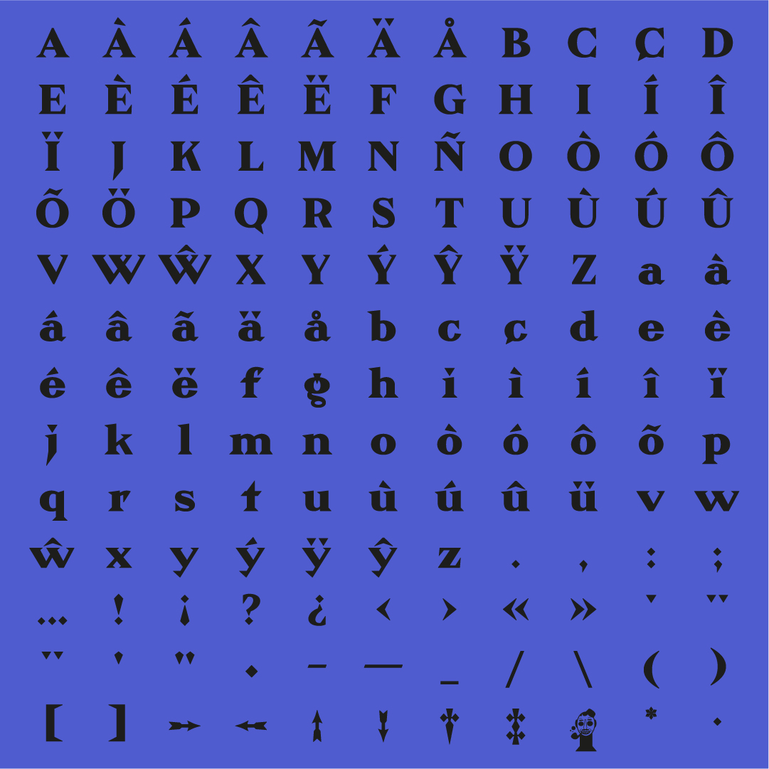


This sharp serif style surprised me for its unique singularities and details. It had a distinctive, aggressive feeling while at the same time, a steady and very geometric sense. I developed this source with a revival exercise guided by François Rapppo at Écal Master Type Design.
The original designer was Julius Klinger, an Austrian graphic and type designer. He witnessed the Vienna Secession, and the Jugendstil marked his work. Klinger Type is, at the same time, a stylistic and rational approach. The symmetry and geometric curves contrast the overly-designed serifs, terminals and distinctive details.


[02] Hooper–Condensed Type–Design 2022
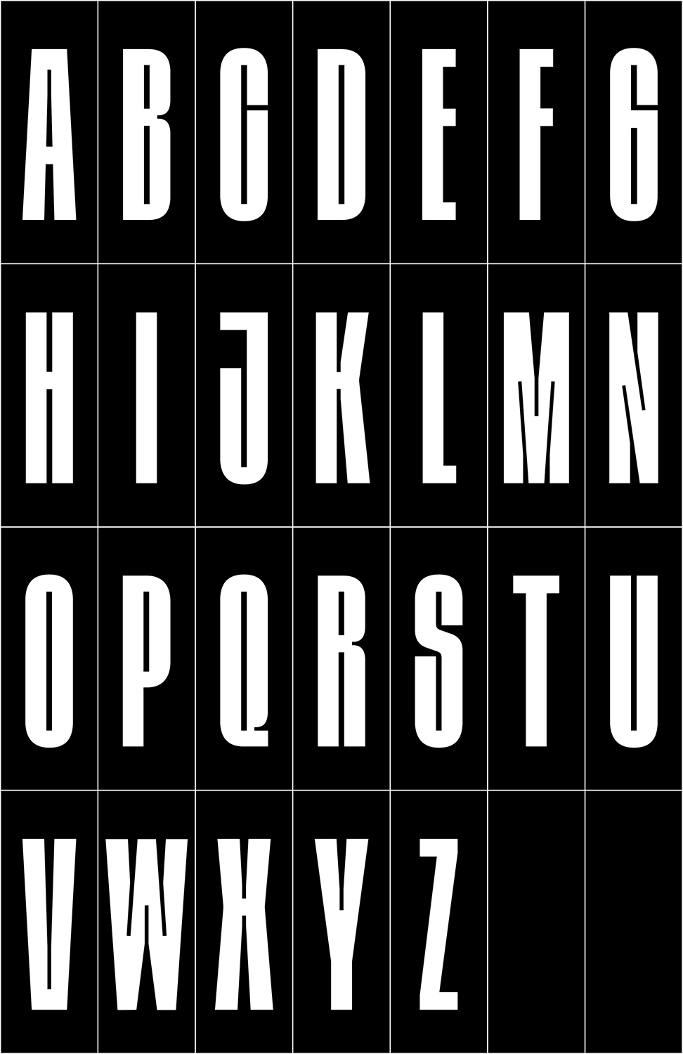
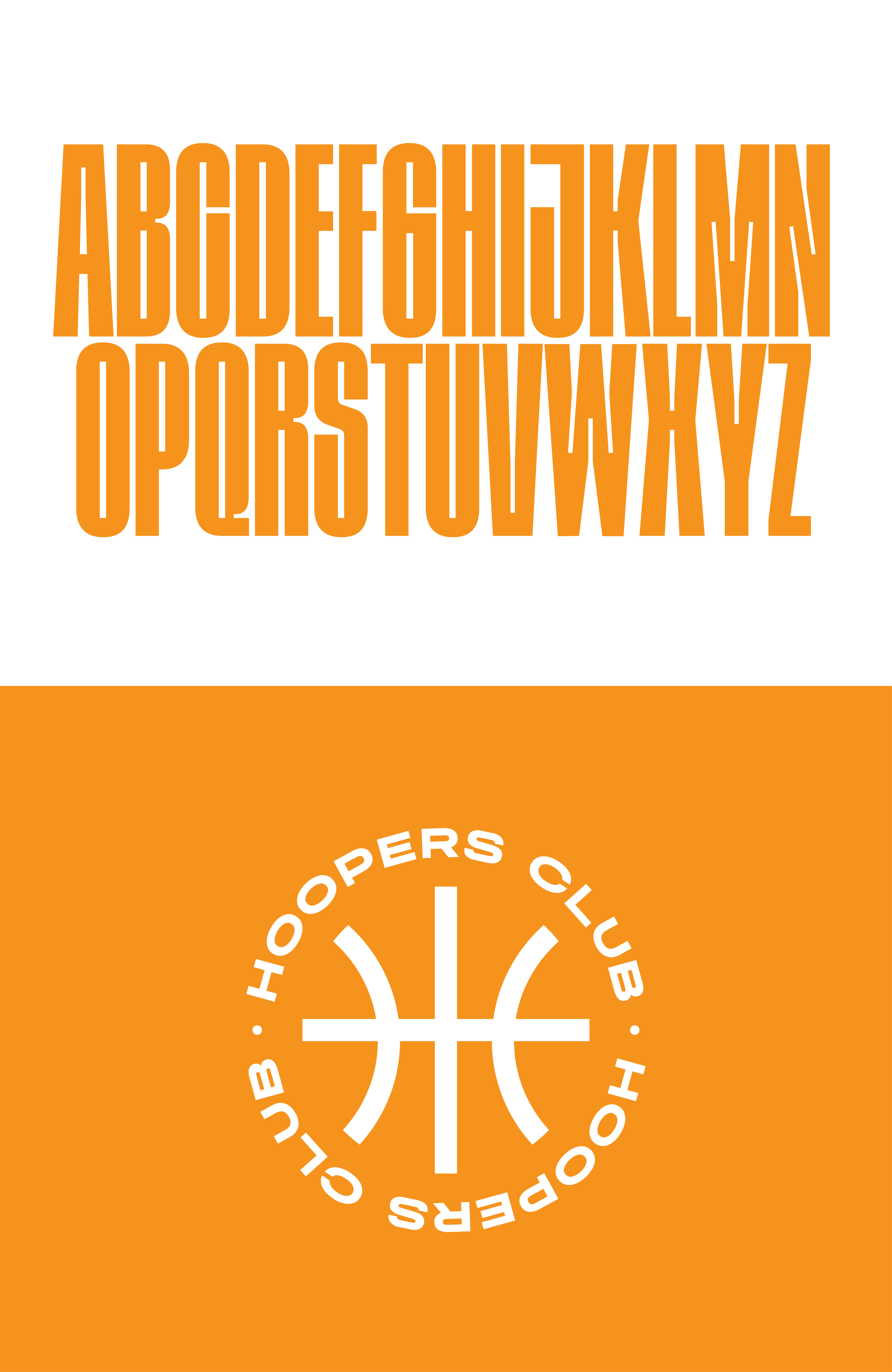
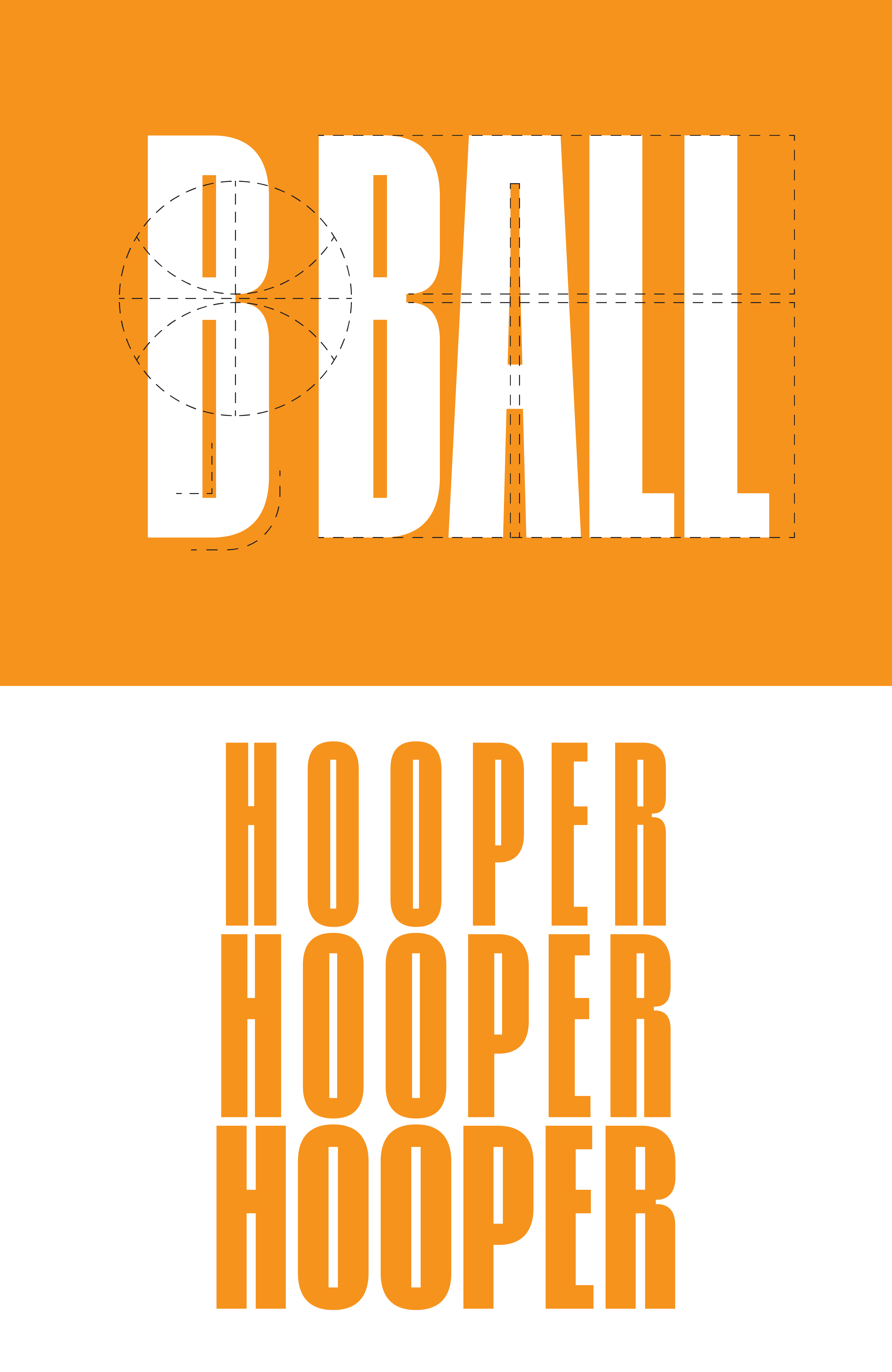
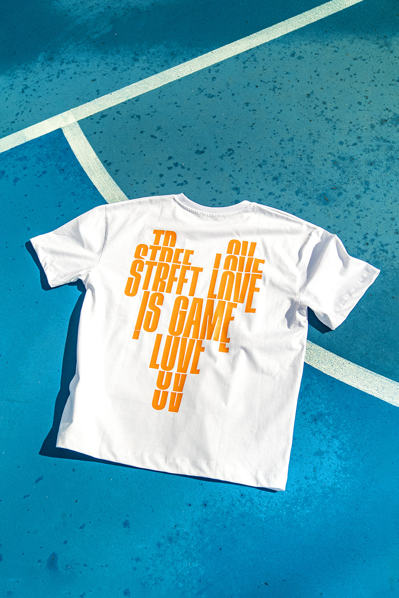
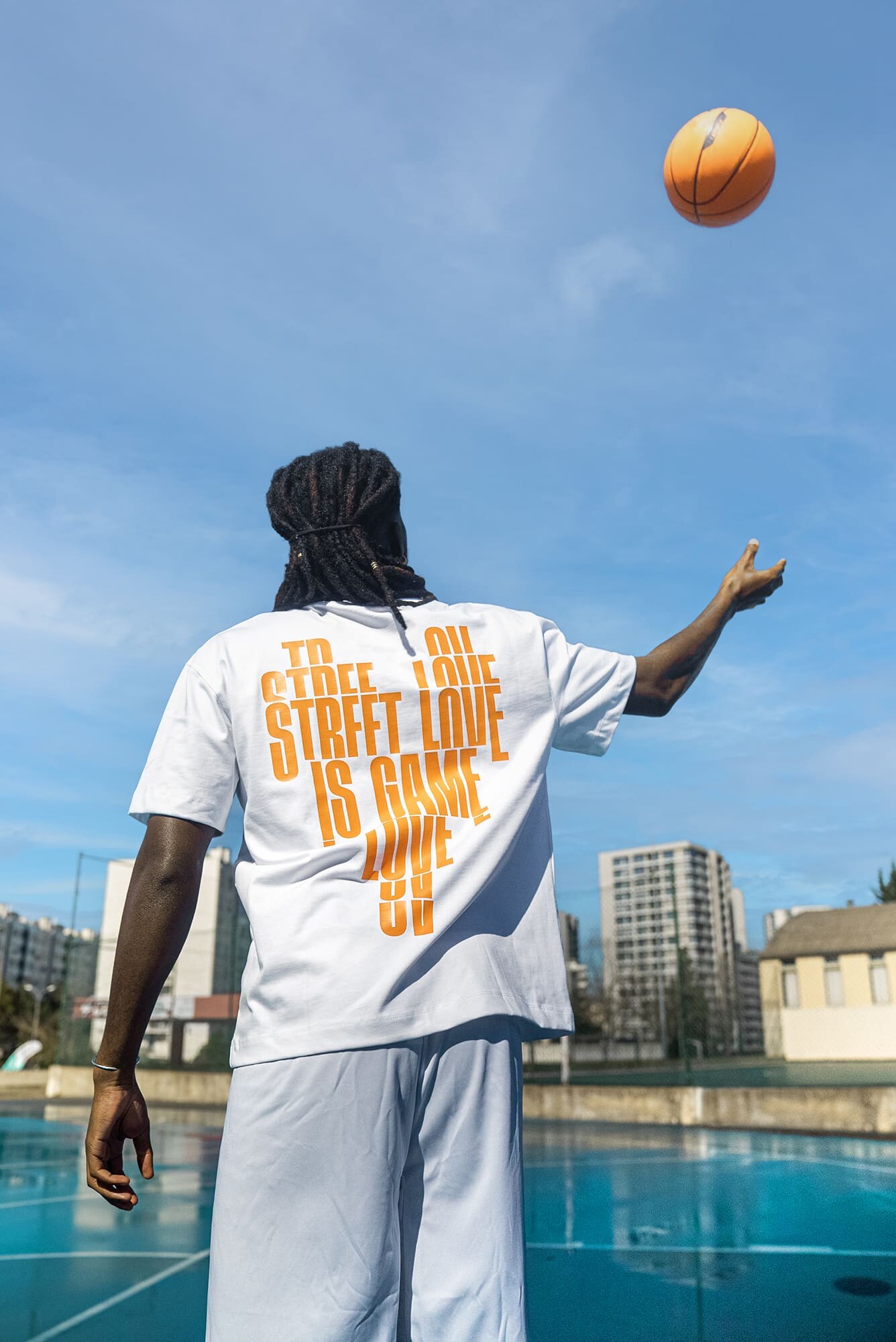
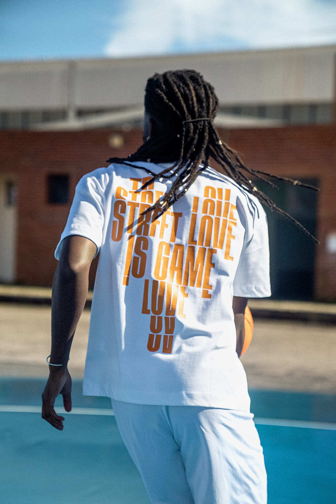
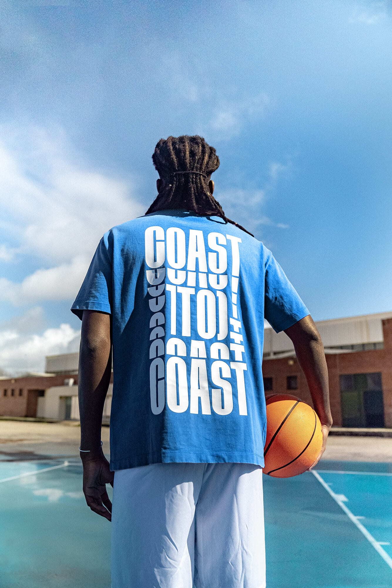
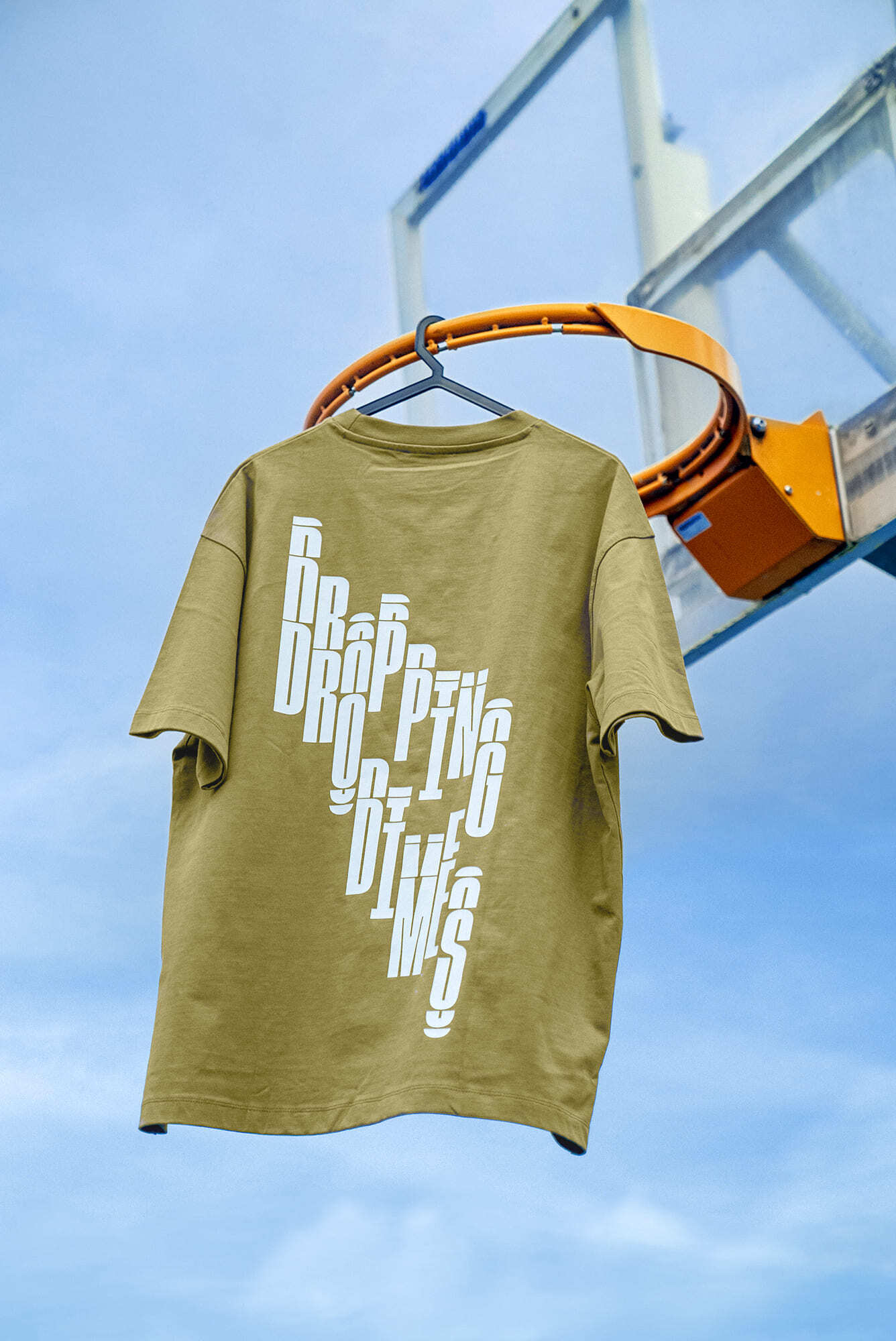
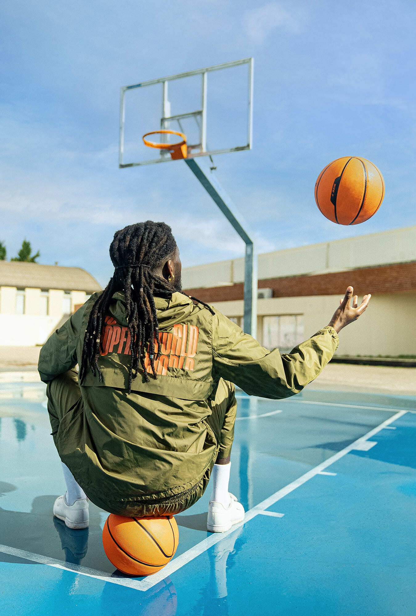
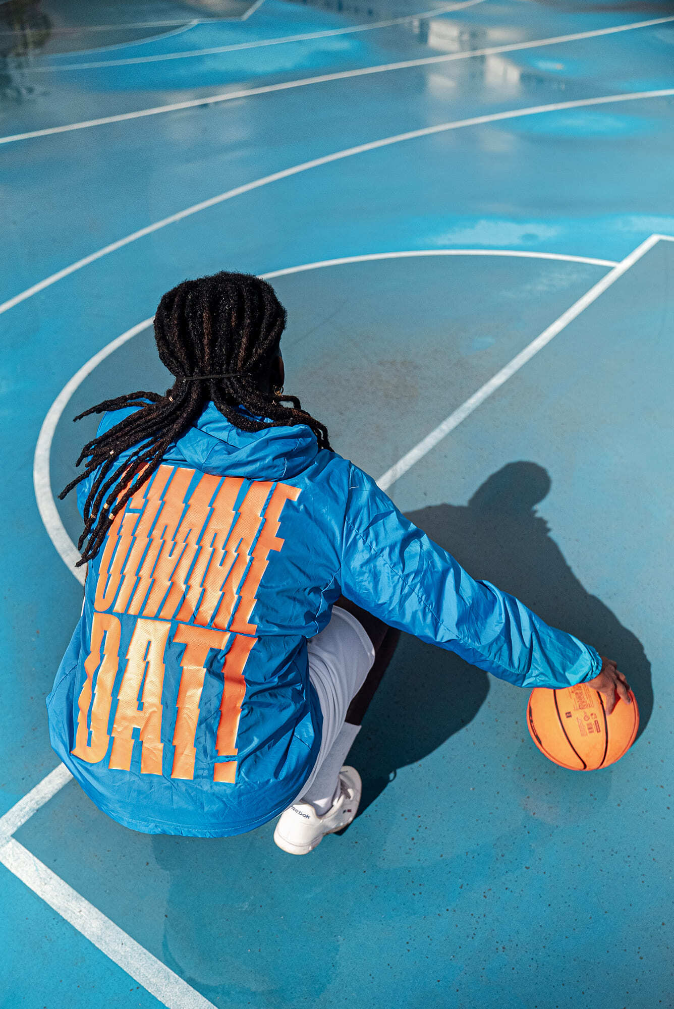
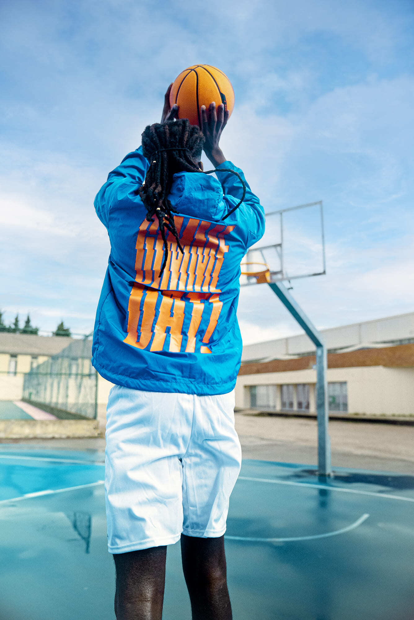
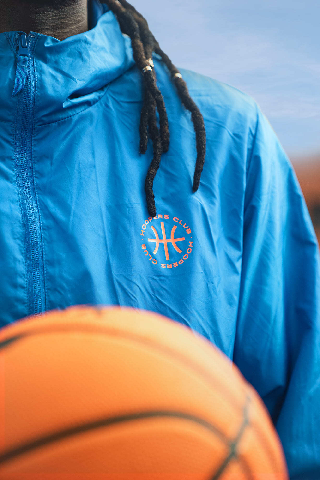
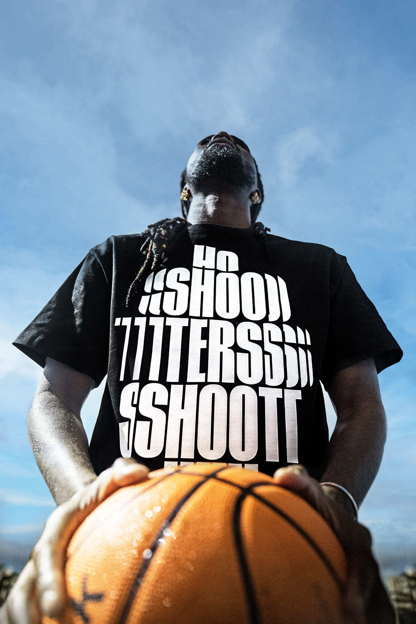
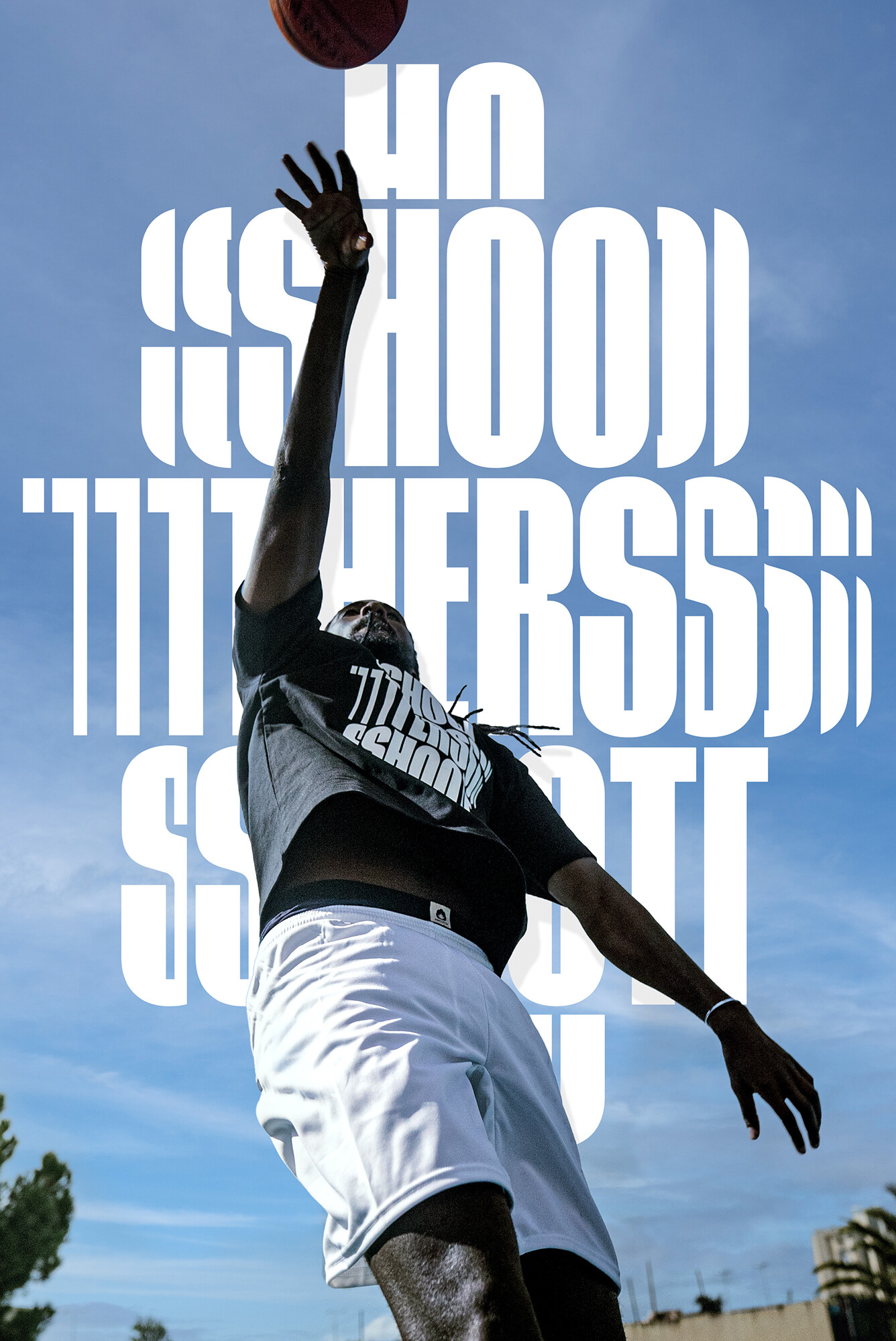
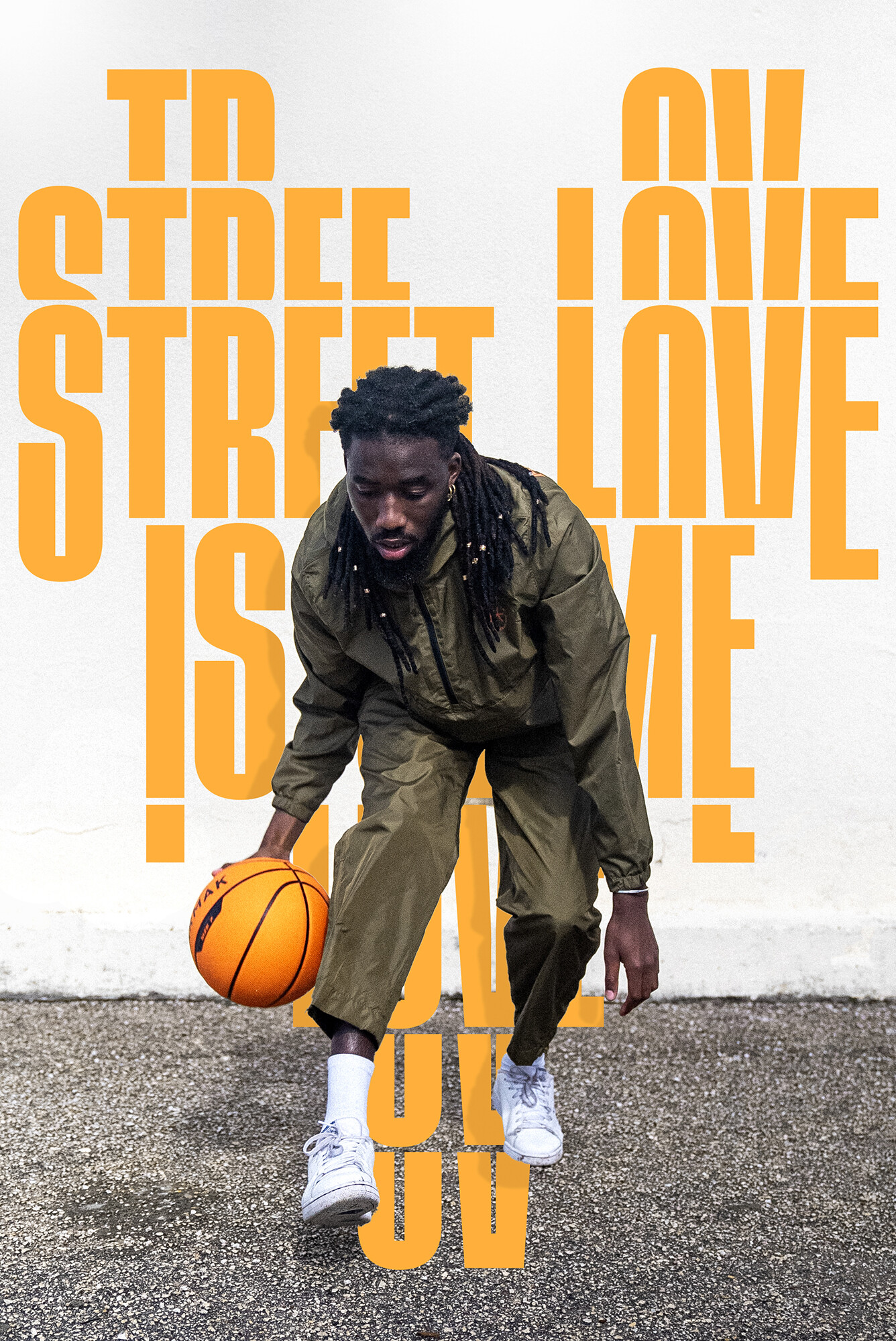
Clothing line design for the 2022 summer launch of Hoopers PT.
I was challenged to design some very bold typographic compositions with basketball slang and sayings.
Starting from scratch, I first designed a custom display typeface. Inspired by a literal basketball ball, I like the contrast between straight lines and round curves. The letters are condensed to express the vertical movement of the sport also increased by the high middle bar.
I design two masters to make some width adjustments possible.
The compositions were designed by only cutting, switching, and moving the type around in two dimensions. The lettering pieces are very graphic and mix the movement in sports with streetwear.
Photos by: Chris Costa
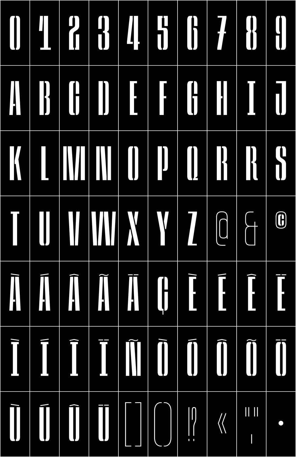
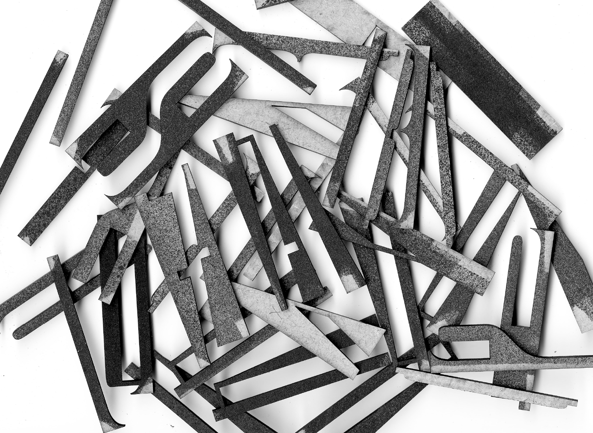
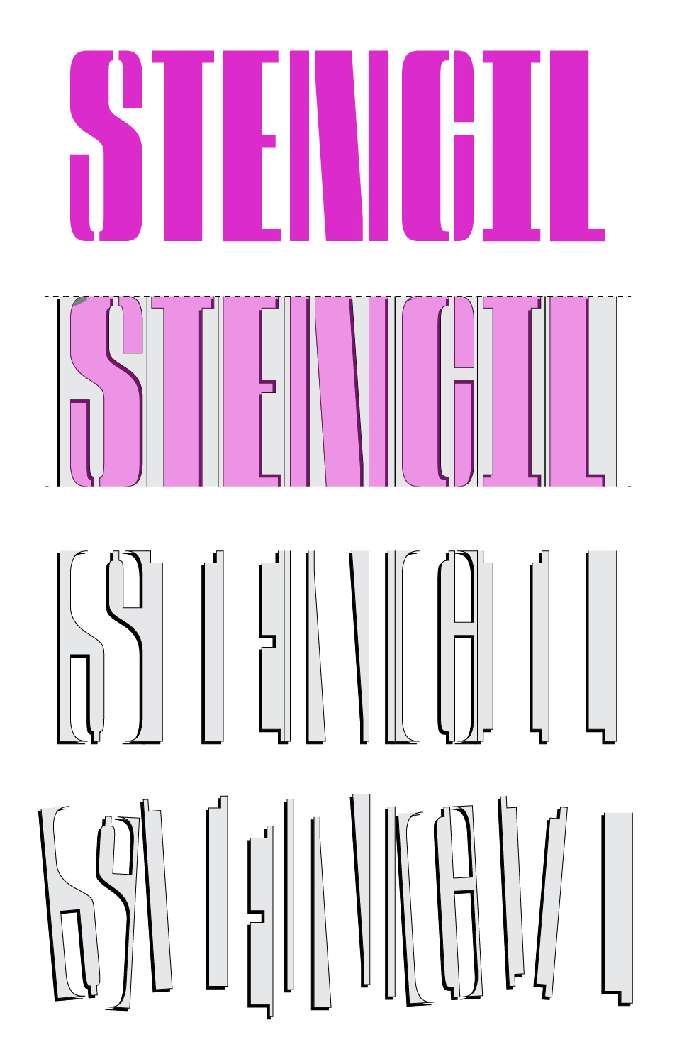
[03] Jab Variable Stencil Type–Design 2023






Typefaces
[01] Klinger–Type Type–Design 2020


This sharp serif style surprised me for its unique singularities and details. It had a distinctive, aggressive feeling while at the same time, a steady and very geometric sense. I developed this source with a revival exercise guided by François Rapppo at Écal Master Type Design.
The original designer was Julius Klinger, an Austrian graphic and type designer. He witnessed the Vienna Secession, and the Jugendstil marked his work. Klinger Type is, at the same time, a stylistic and rational approach. The symmetry and geometric curves contrast the overly-designed serifs, terminals and distinctive details.


[02] Hooper-Condensed Type–Design 2022


Clothing line design for the 2022 summer launch of Hoopers PT.
I was challenged to design some very bold typographic compositions with basketball slang and sayings.
Starting from scratch, I first designed a custom display typeface. Inspired by a literal basketball ball, I like the contrast between straight lines and round curves. The letters are condensed to express the vertical movement of the sport also increased by the high middle bar.
I design two masters to make some width adjustments possible.
The compositions were designed by only cutting, switching, and moving the type around in two dimensions. The lettering pieces are very graphic and mix the movement in sports with streetwear.
Photos by: Chris Costa


[03] Jab Variable Stencil Type–Design 2023


João Varela, 2024
©
Back Up ↑

João Varela, 2024
©