Graphic & Type Design
In this half of my portfolio, you will discover sharp-cut letters, bold graphics, and carefully crafted visuals. While doing my MA at ÉCAL, I learned how to approach the technical process of type design creatively. Flip to the other side of this website to find an experimental space full of colors and giant letters.
[01] Hoopers–Collection Clothing–Design 2022
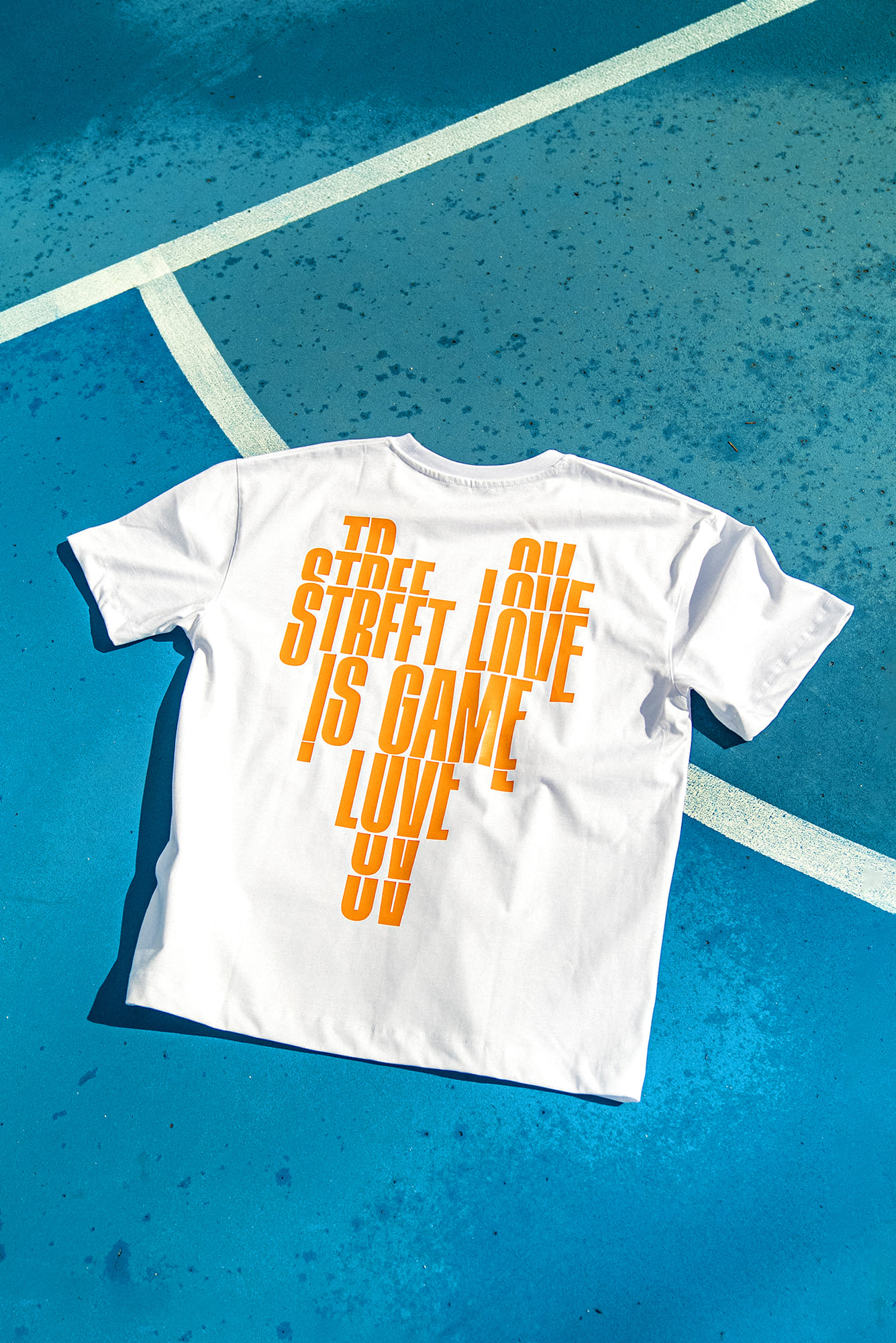
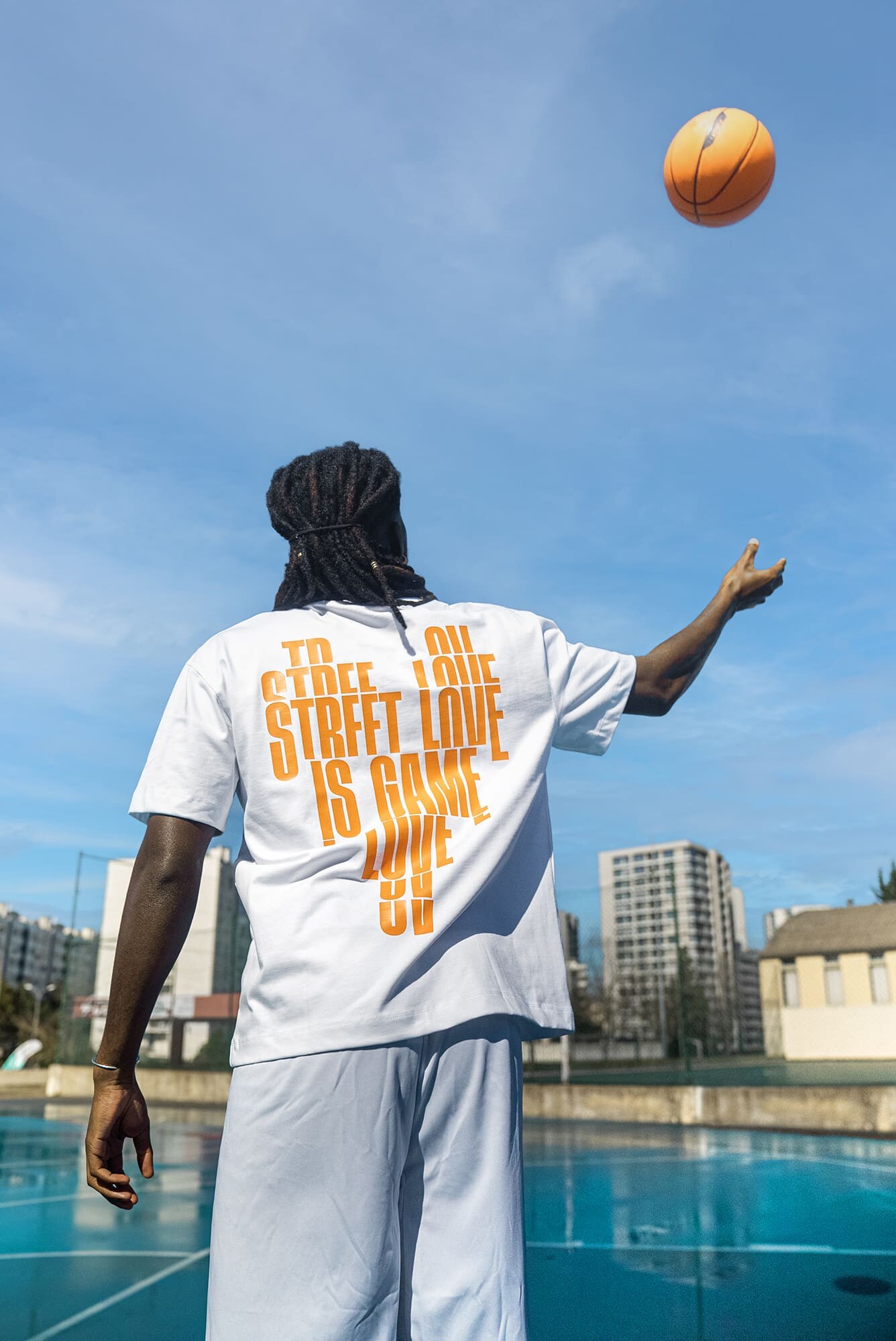
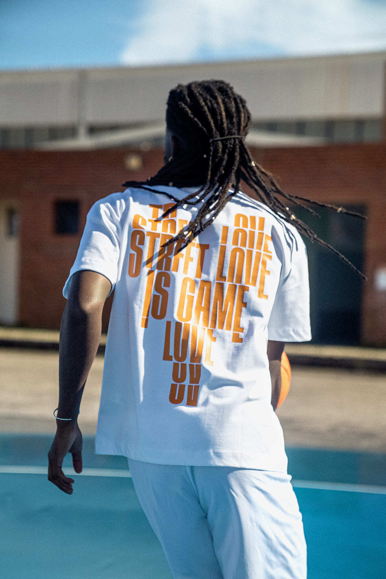
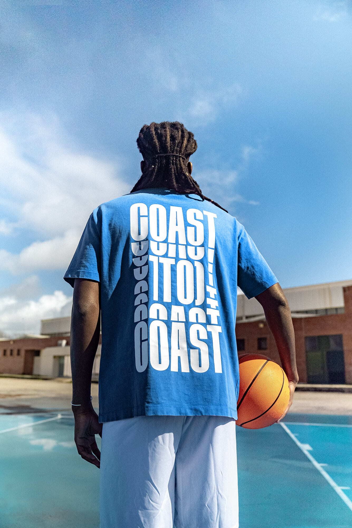
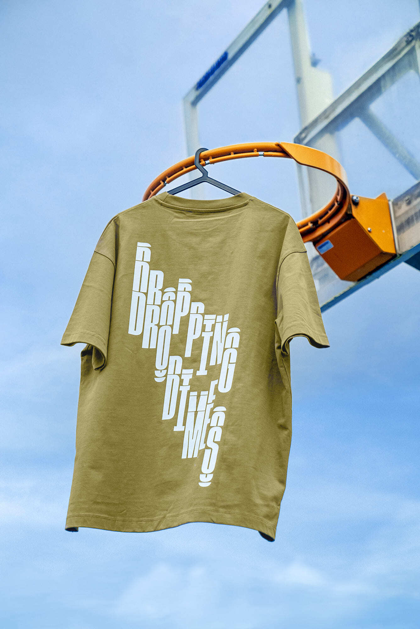
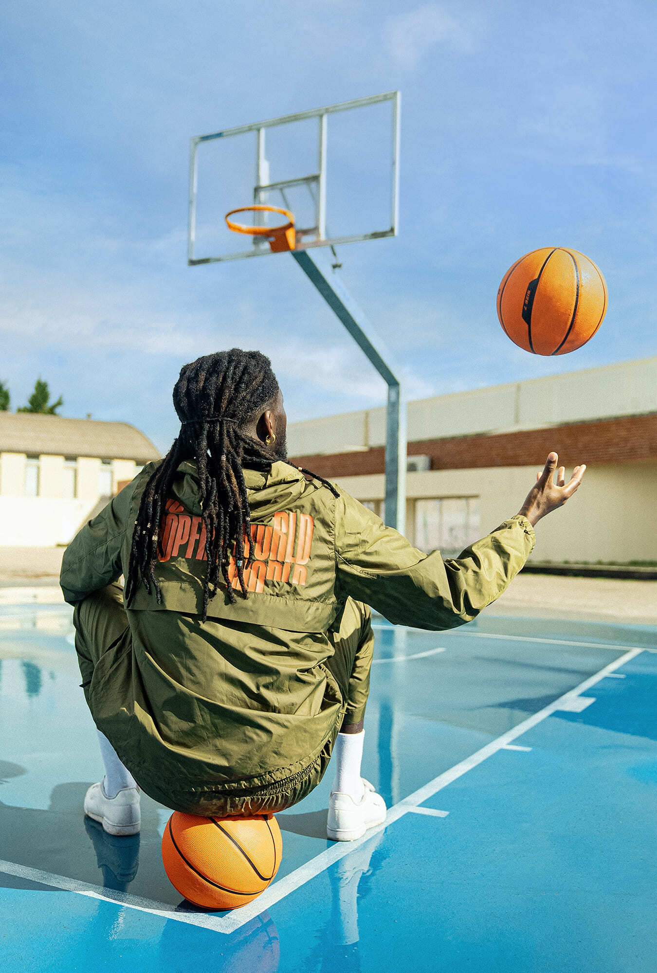
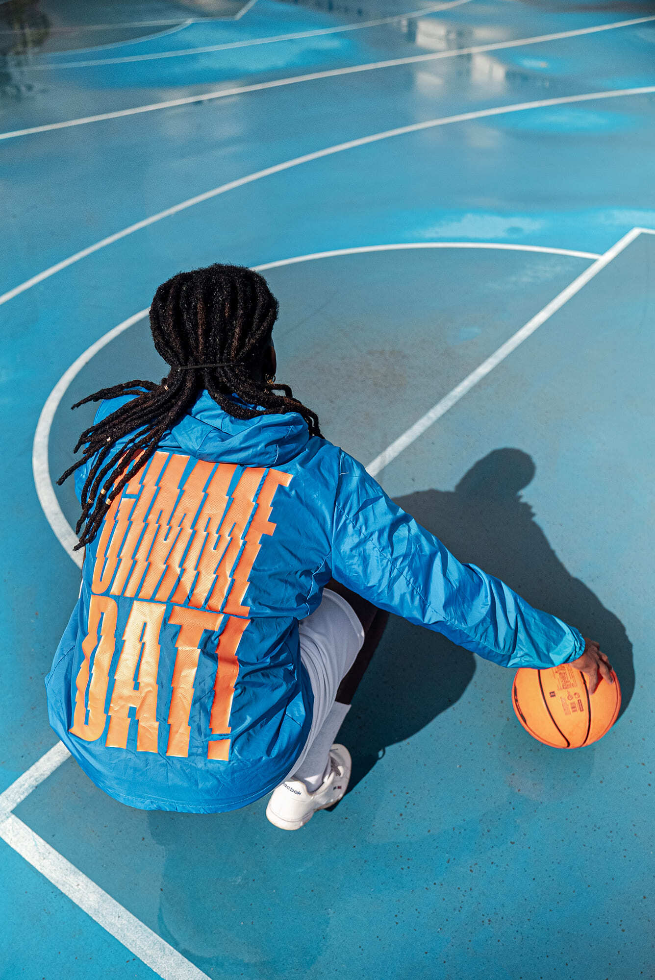
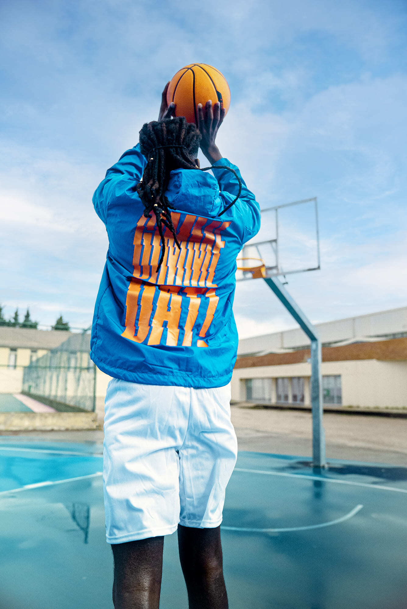
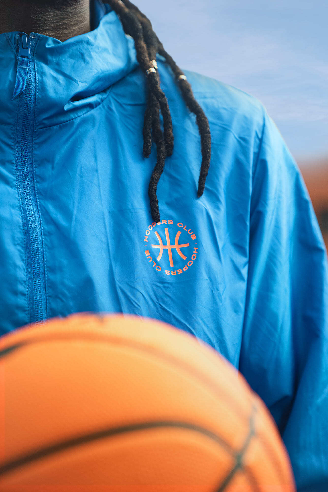
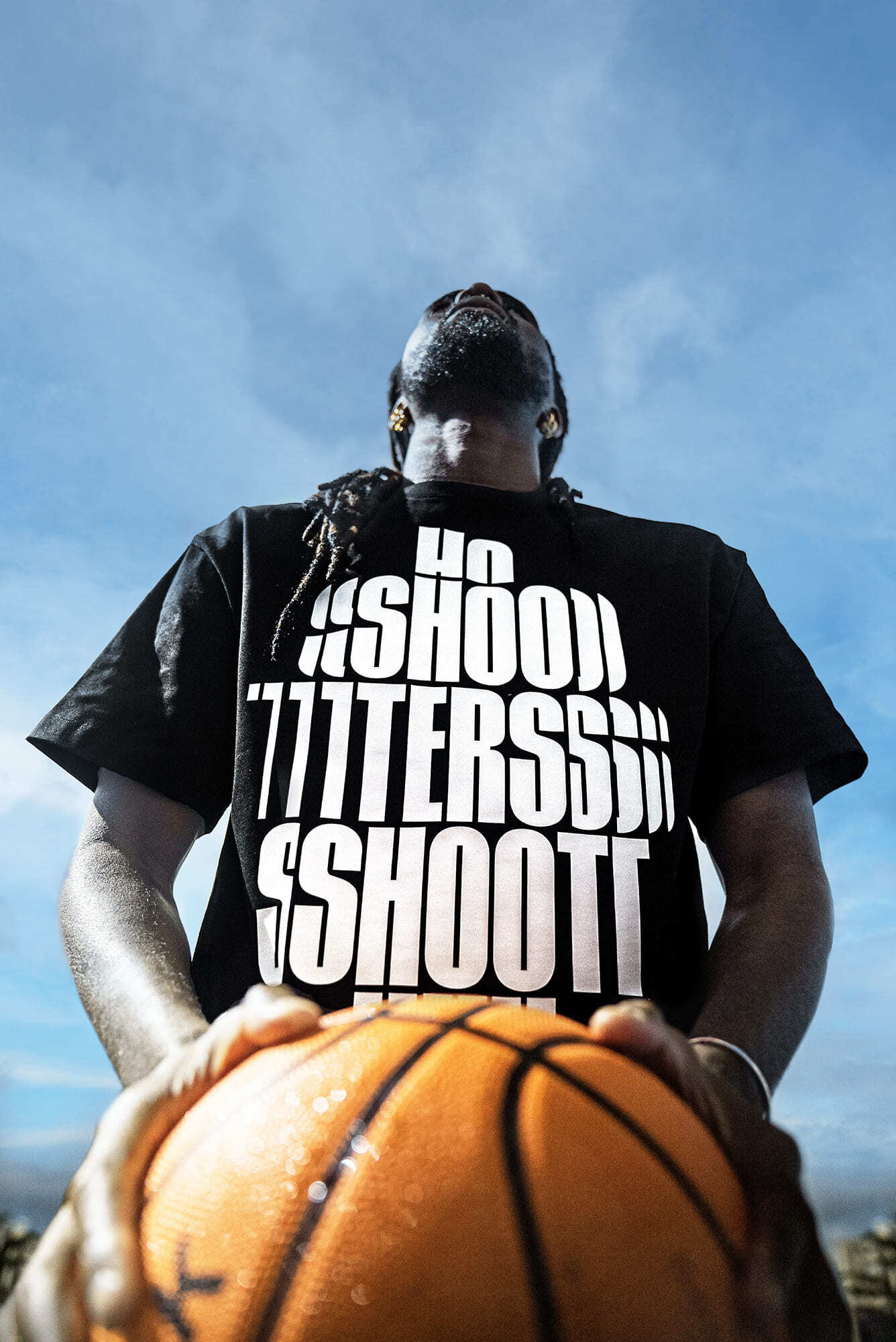
Clothing line design for the 2022 summer launch of Hoopers PT.
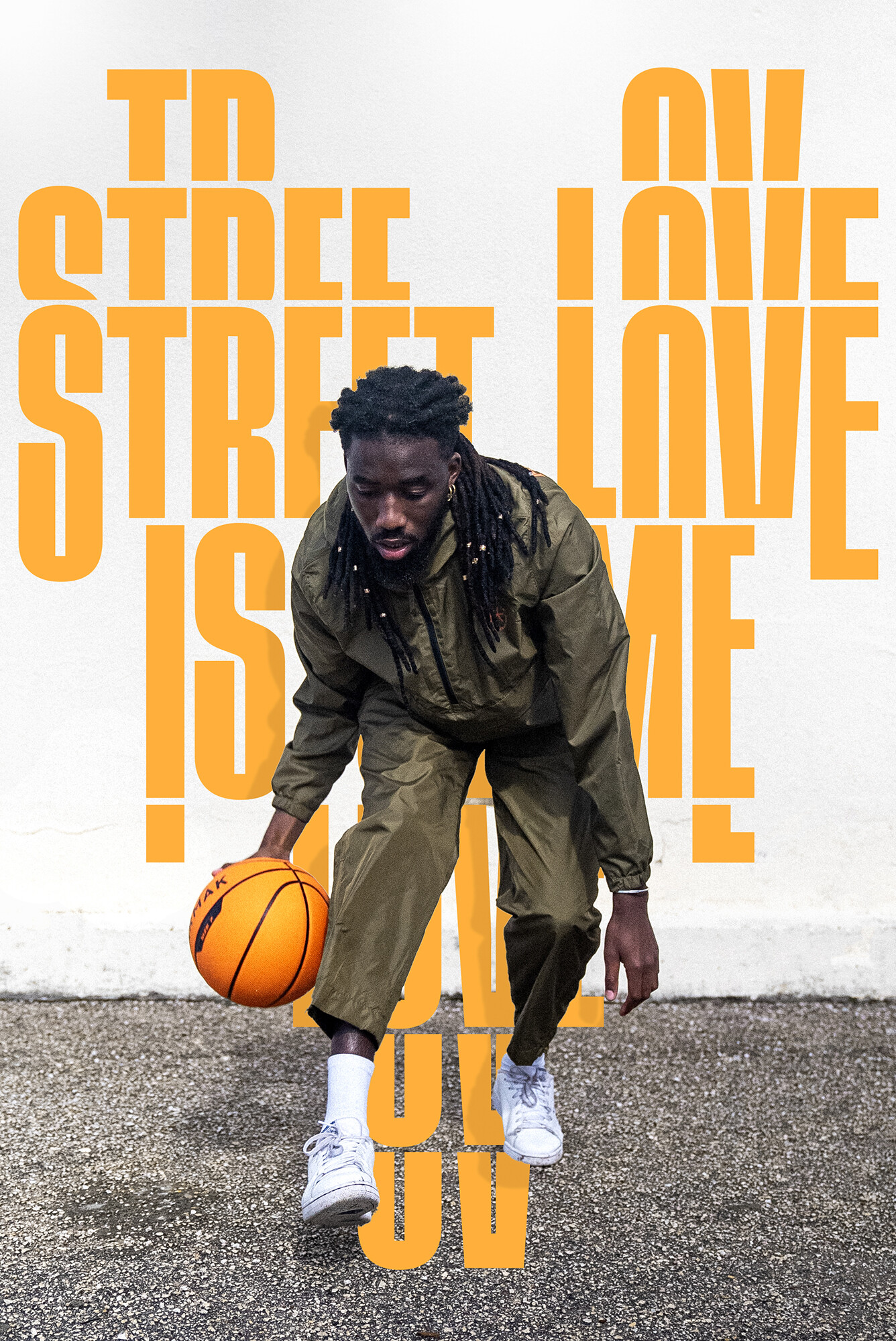
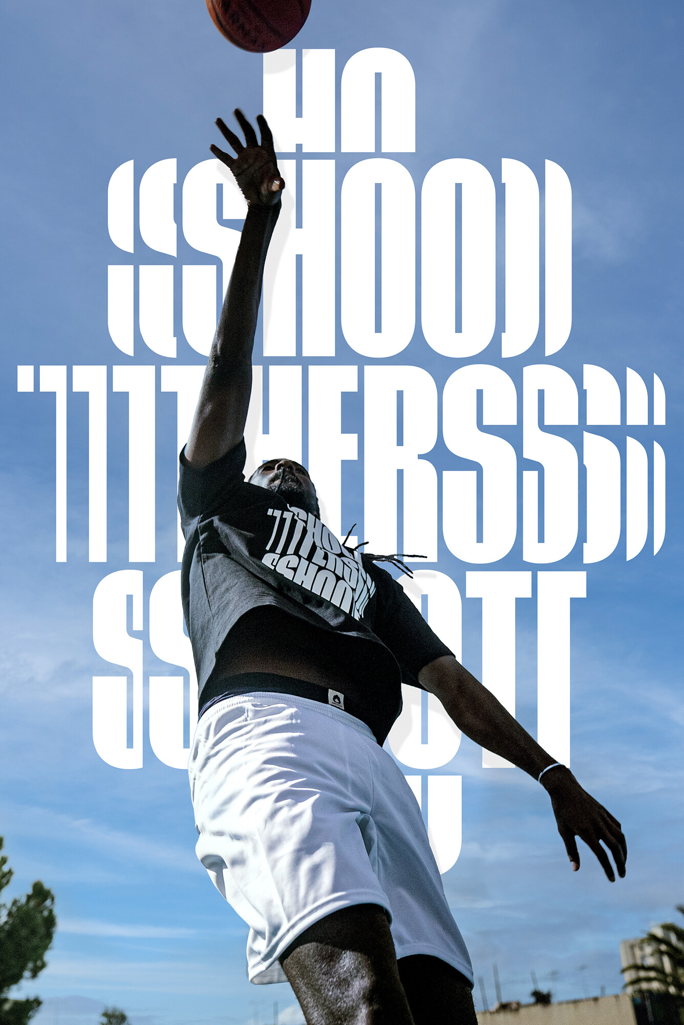
I was challenged to design some very bold typographic compositions with basketball slang and sayings.
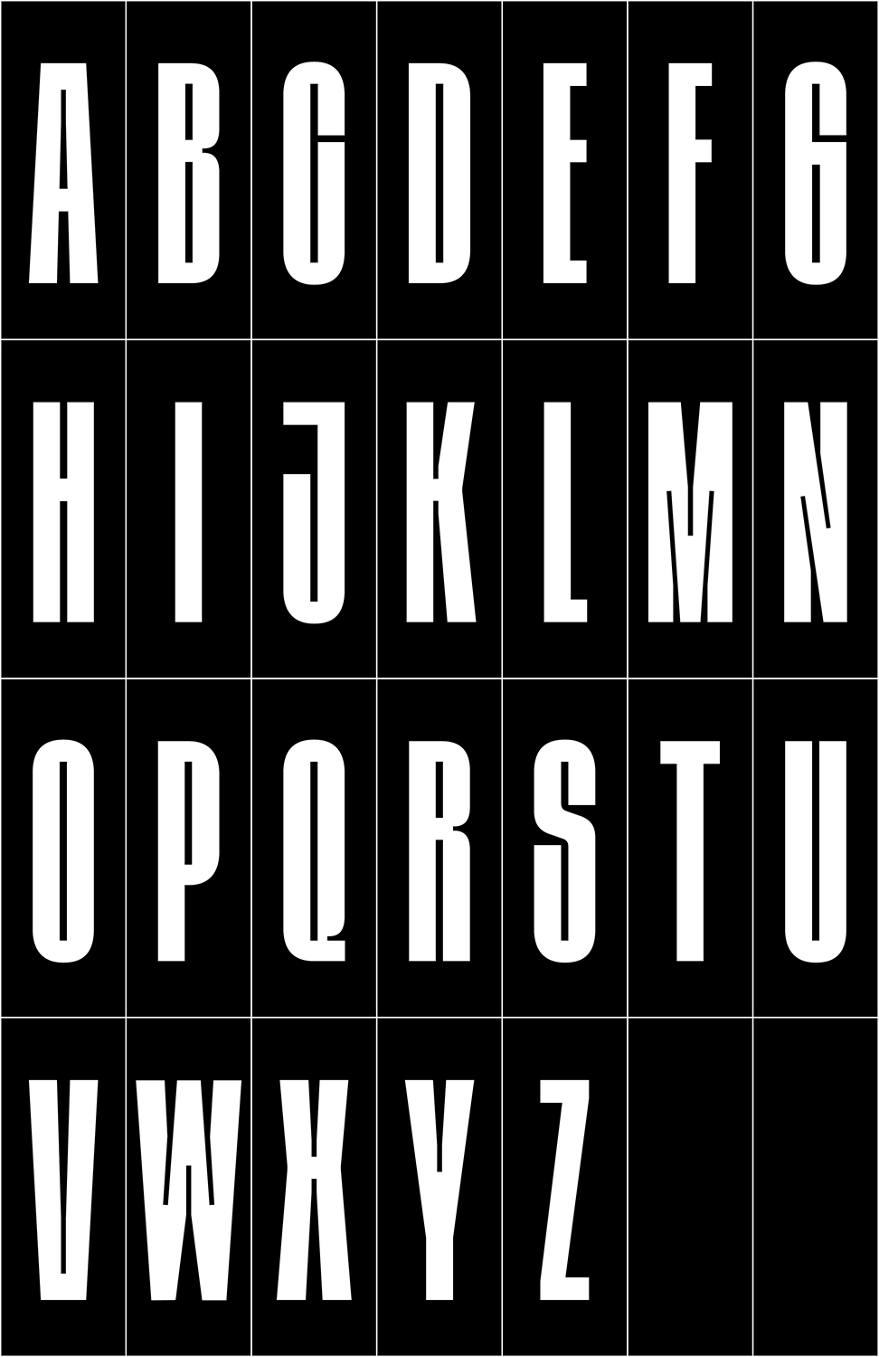
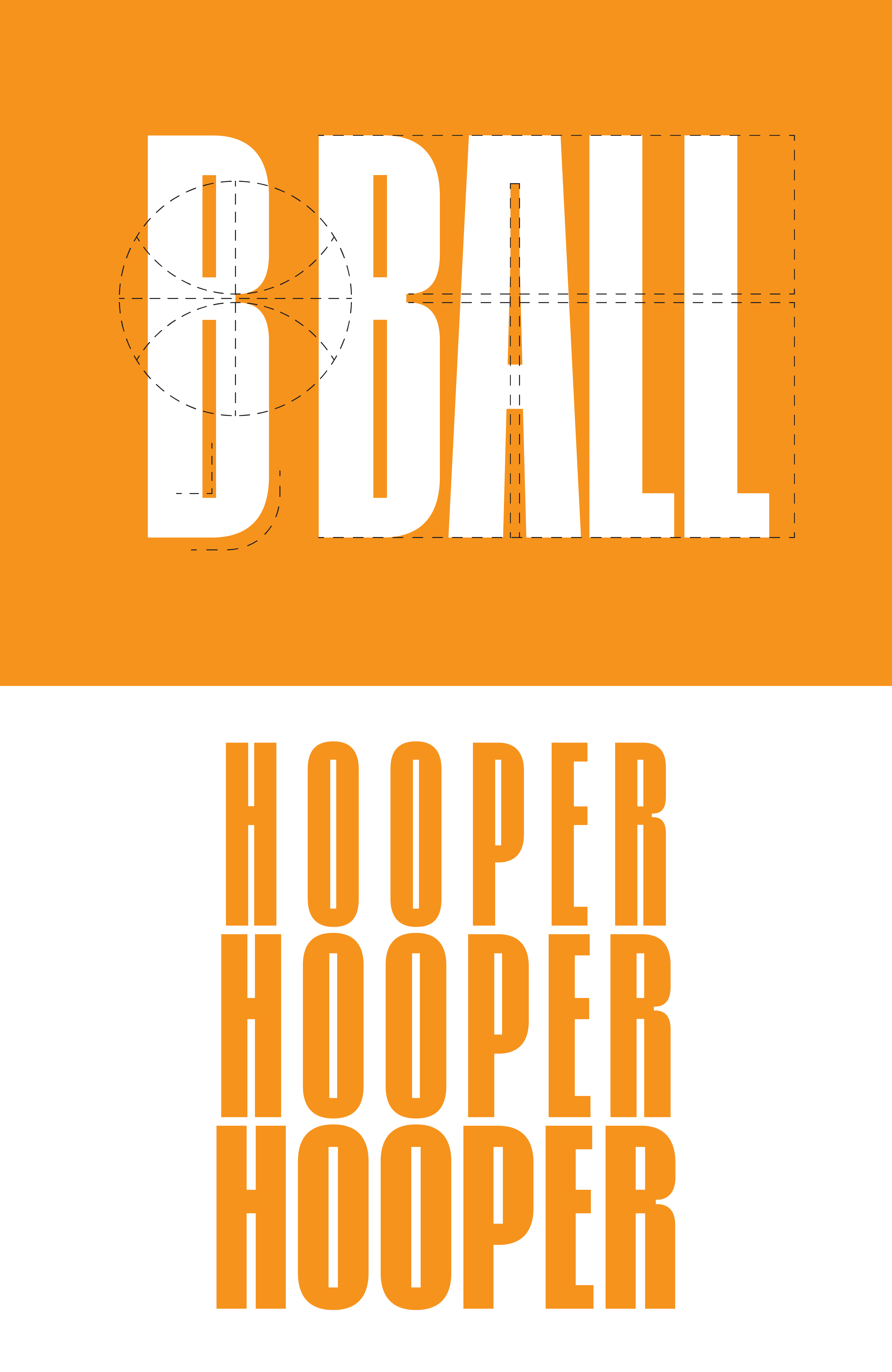
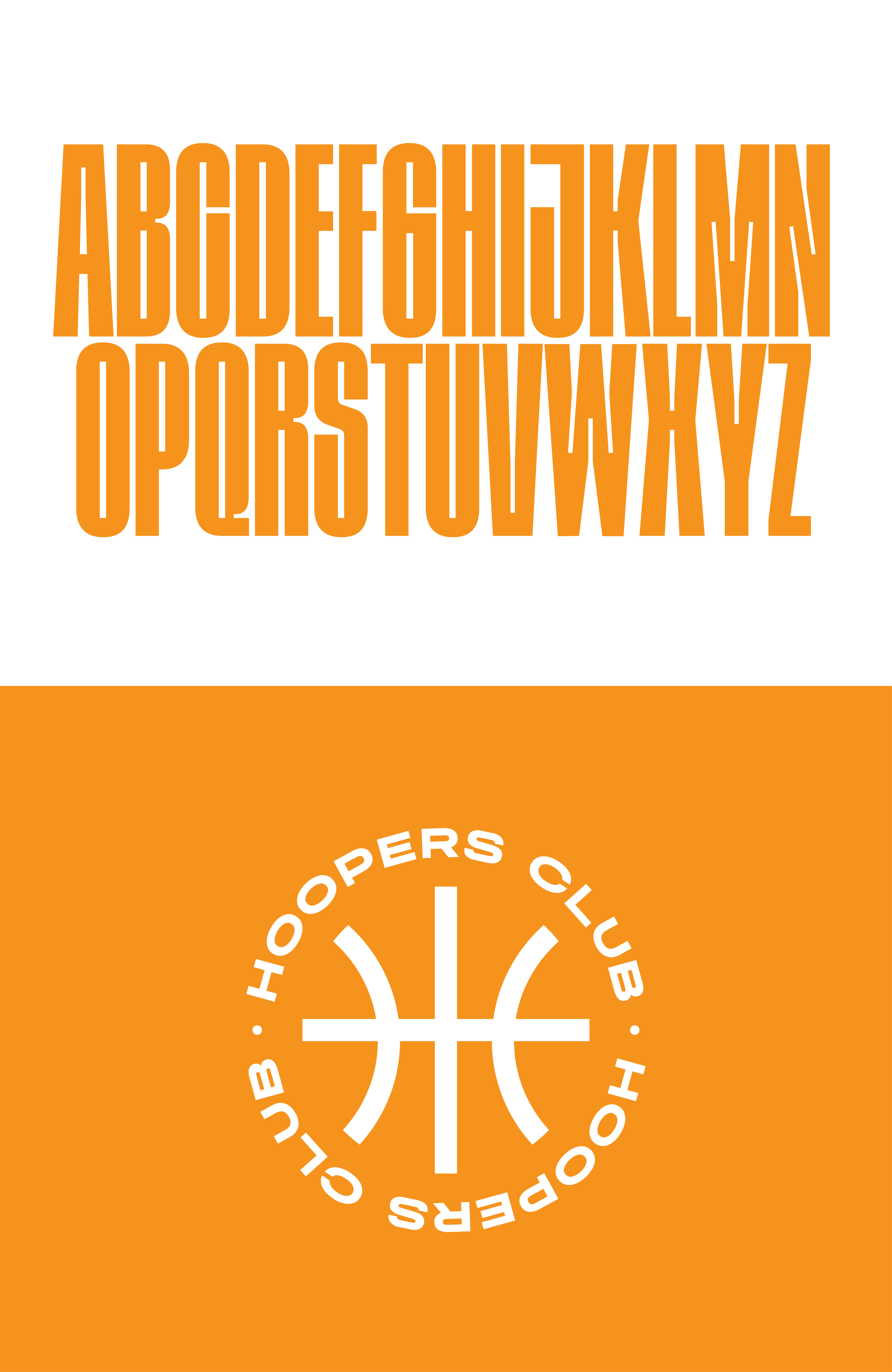
Starting from scratch, I first designed a custom display typeface. Inspired by a literal basketball ball, I like the contrast between straight lines and round curves. The letters are condensed to express the vertical movement of the sport also increased by the high middle bar.
I design two masters to make some width adjustments possible.
The compositions were designed by only cutting, switching, and moving the type around in two dimensions. The lettering pieces are very graphic and mix the movement in sports with streetwear.
Photos by: Chris Costa
[02] WOOL Art–Festival Identity 2022
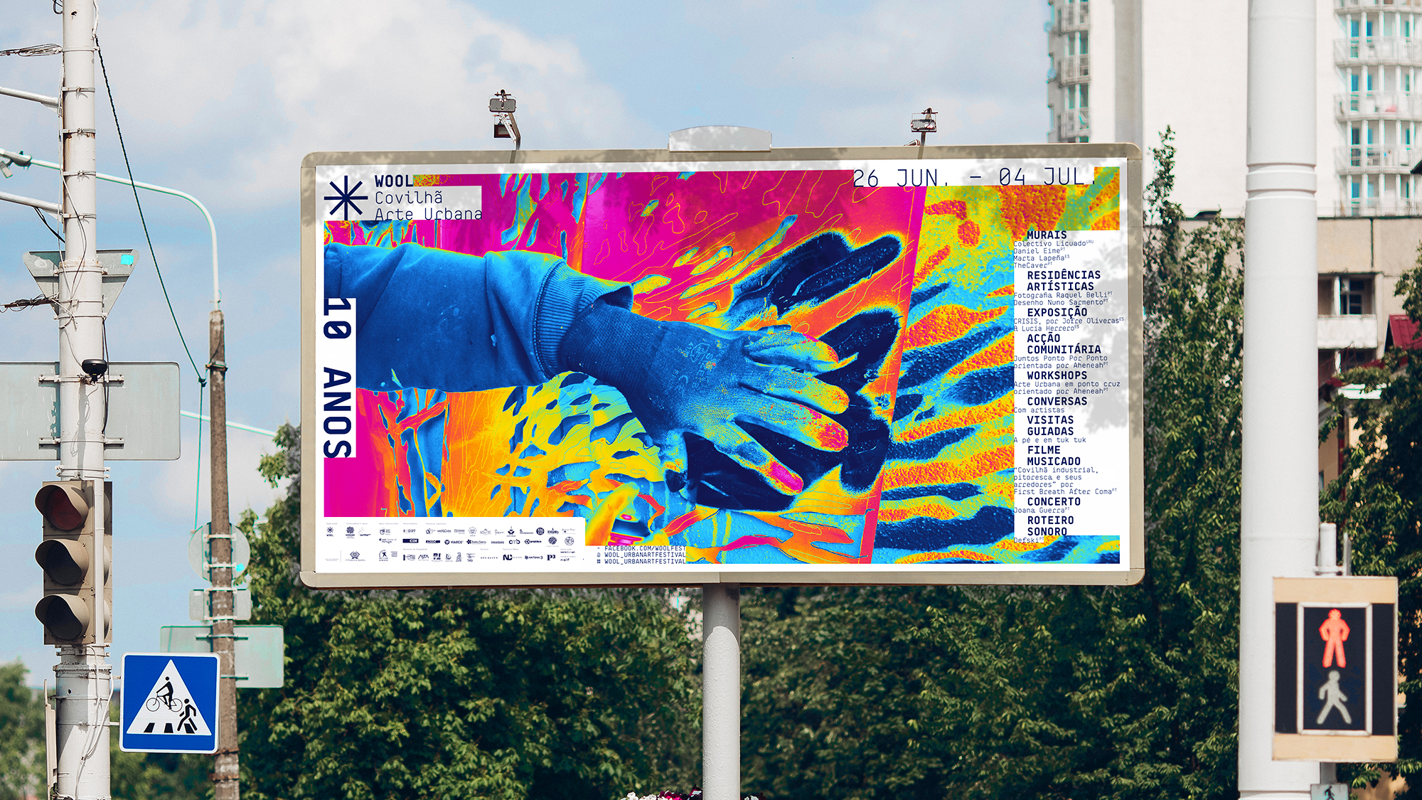


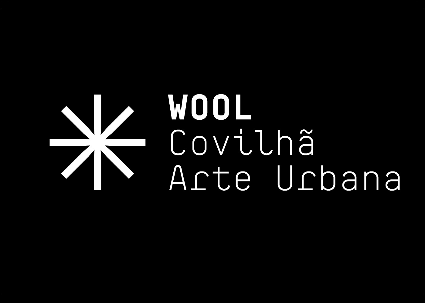
For the 10th edition of WOOL Covilhã Arte Urbana, the oldest urban art festival in Portugal, I had the opportunity to develop its identity together with Ana Martins.
We aimed to dig up photos of the works in progress that took over the last few years and treat them with some overlaid gradients. The vibrant colors referred to the artworks of the festival but also the topographic and weather maps, characteristic of the mountains where WOOL happens.
The glitched box layouts came up while thinking about the festival's archive, imagining that the "info" would be displayed on different pop-up windows, and old data would be glitched out.
[03] Klinger–Type Type–Design 2020

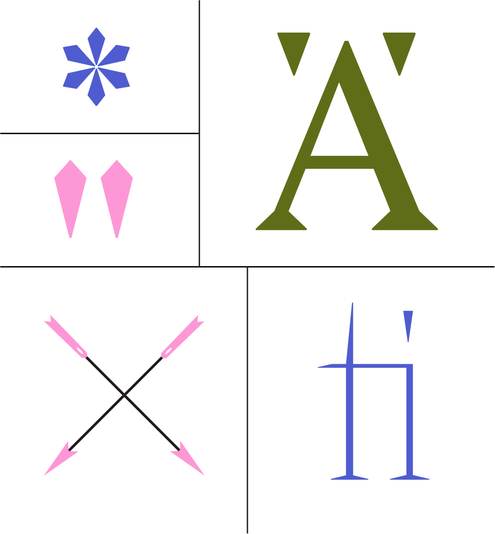

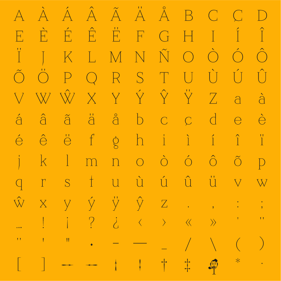


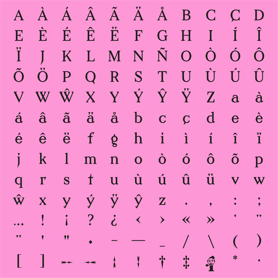


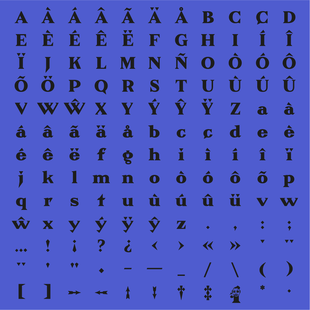


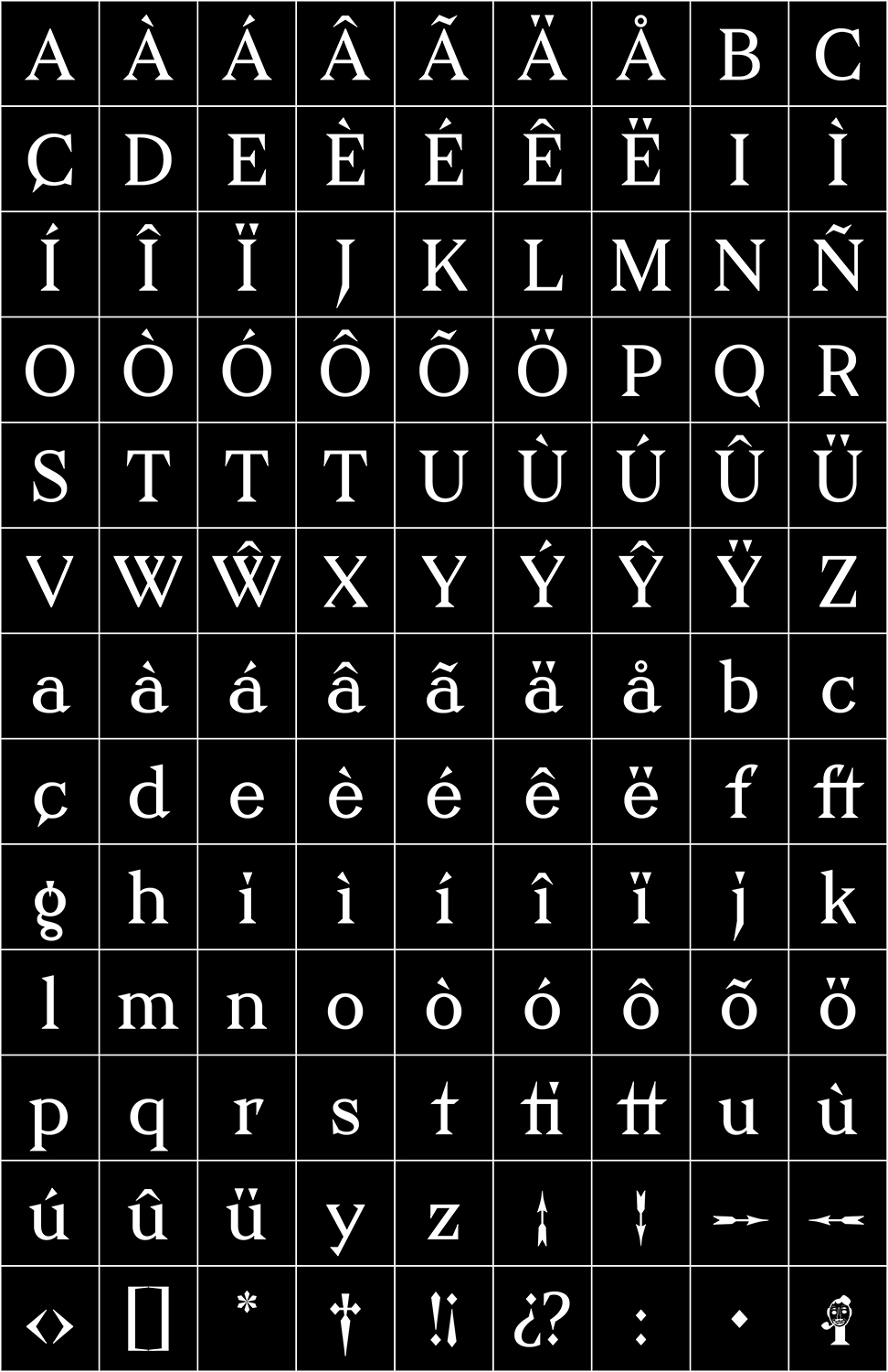
This sharp serif style surprised me for its unique singularities and details. It had a distinctive, aggressive feeling while at the same time, a steady and very geometric sense. I developed this source with a revival exercise guided by François Rapppo at Écal Master Type Design.
The original designer was Julius Klinger, an Austrian graphic and type designer. He witnessed the Vienna Secession, and the Jugendstil marked his work. Klinger Type is, at the same time, a stylistic and rational approach. The symmetry and geometric curves contrast the overly-designed serifs, terminals and distinctive details.


[04] 36–Days–Of–Type 2022


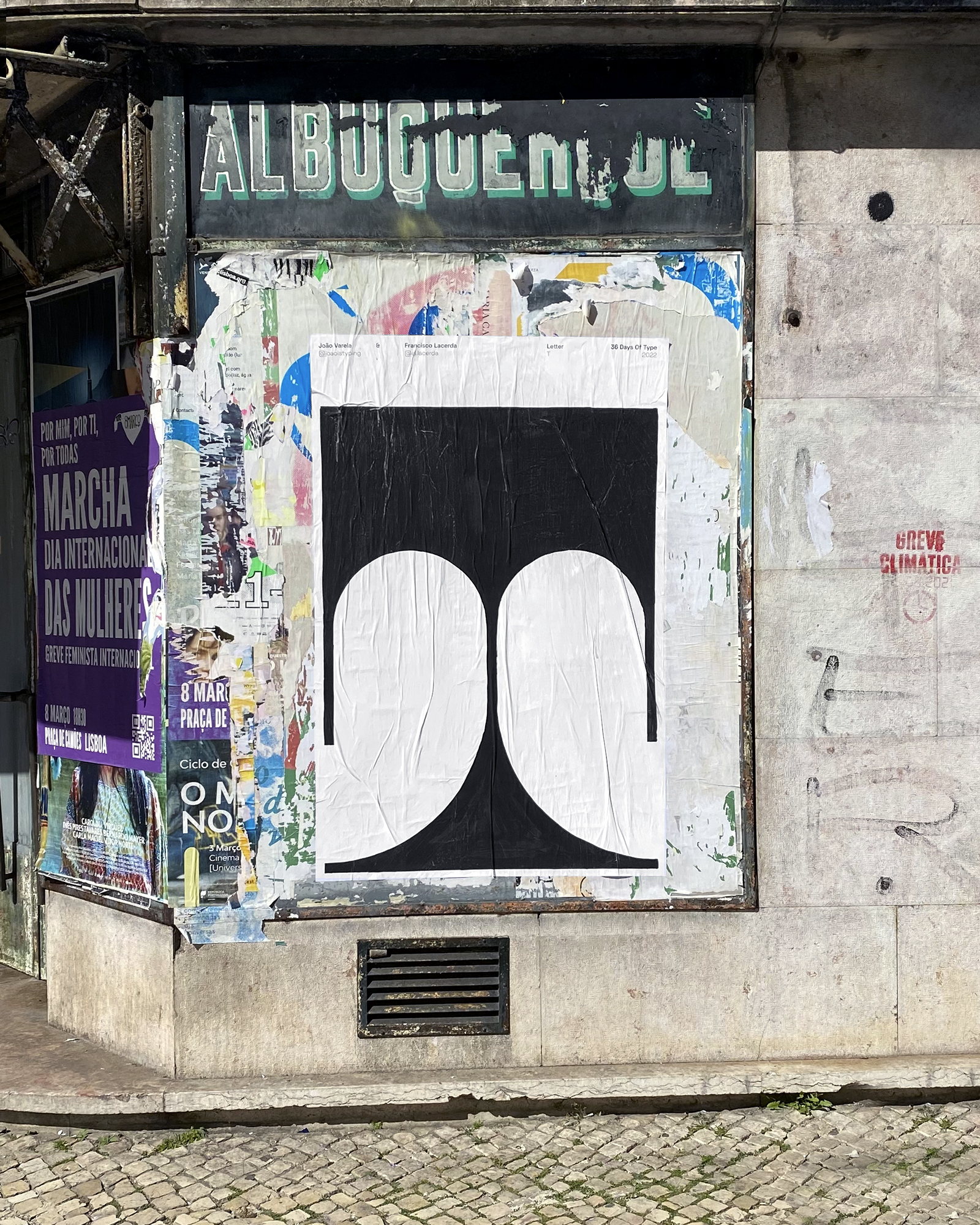


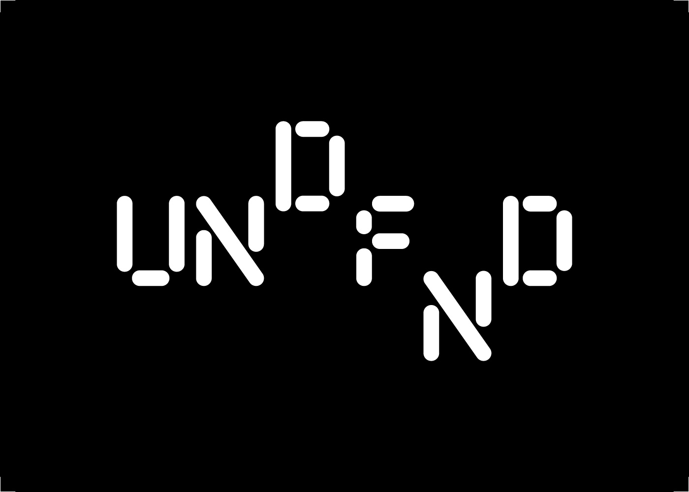
This mixed and matched alphabet is the result of a couple of fun days drawing letters and glueing posters around the streets of Lisbon. Made together with Francisco Lacerda, this was our participation in 36 Days Of Type.
Collaboration: Francisco Lacerda


[05] No–Walls Art–Festival Identity 2021


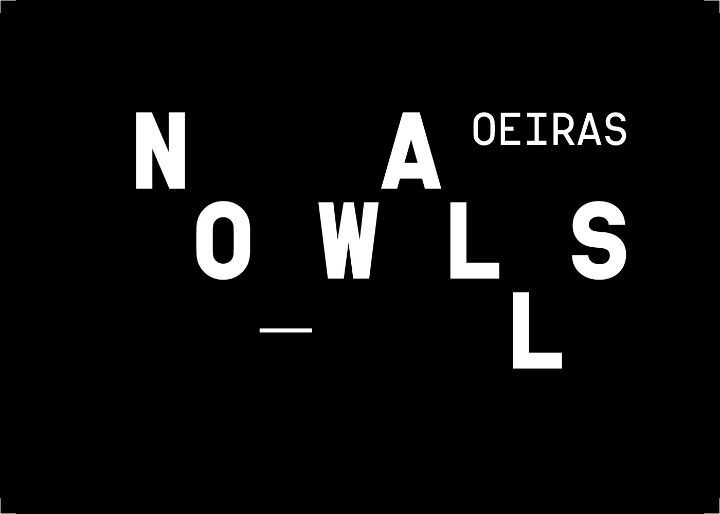
“NO WALLS” is a street art festival that took place in Oeiras, Portugal. During the festival, the artists were challenged to question the field of action of their artistic practice and the limits of urban art. Additionally, there were literally no walls, unlike the “regular” street art, the interventions were all created in tridimensional structures.
For its visual identity, we developed a logo that intends to transmit this concept of total freedom. The letters that make up the logo are not fixed to any baseline or box, they float (within a variable grid) creating different interpretations of the logo.
We decided to extend the basic concept of the logo to the remaining graphic pieces by reinforcing the dynamic, lightness and transparency. To express this, we created an abstract background with organic blurred shapes and warm colors that complement the typographic compositions.
Collaboration: Ana Martins

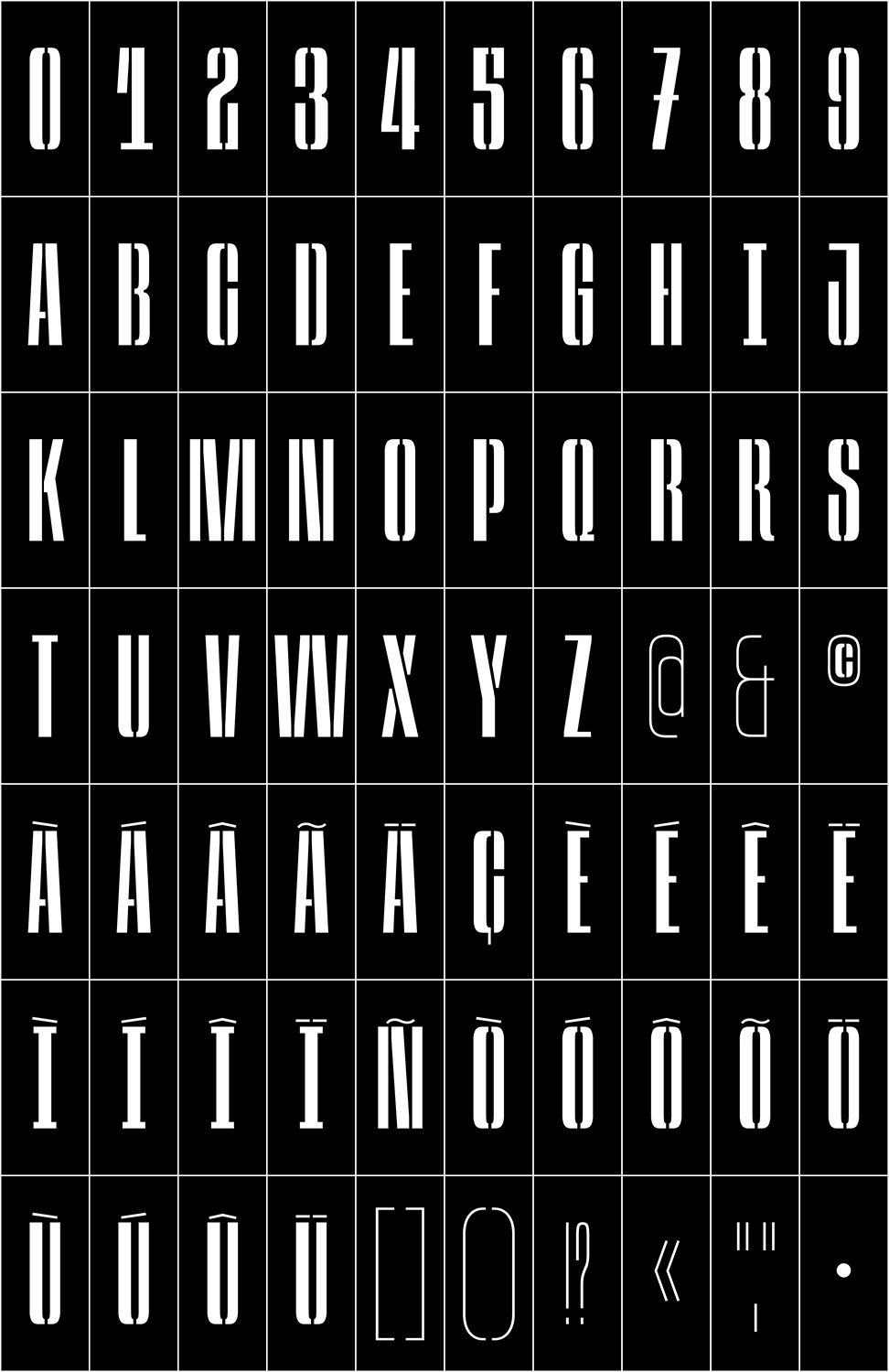
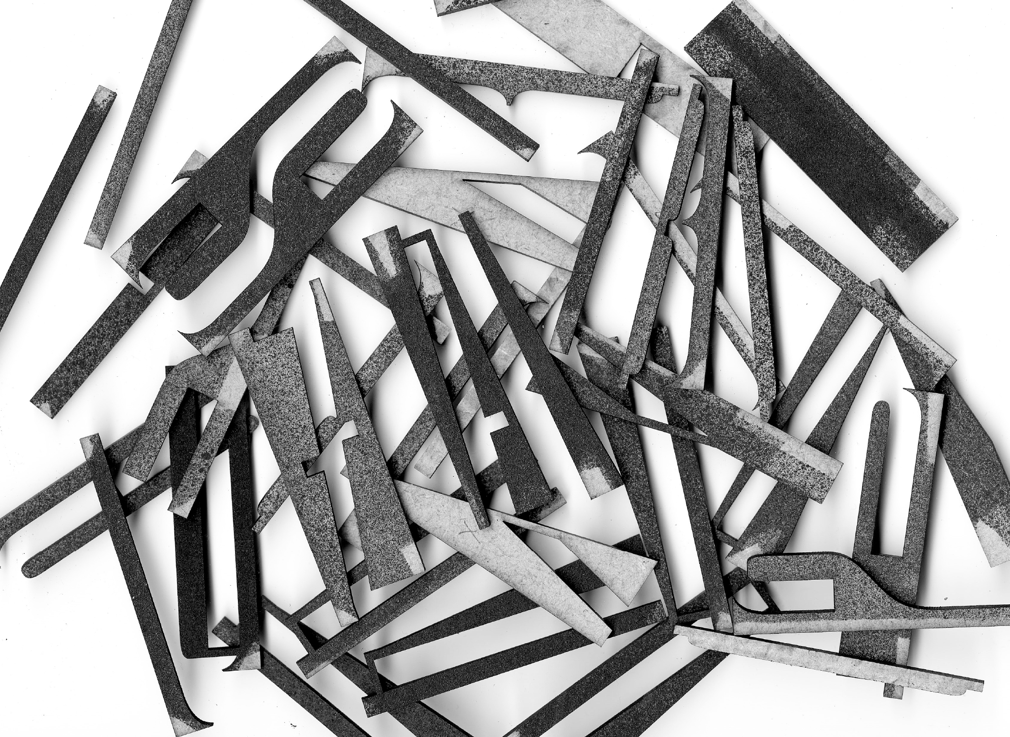
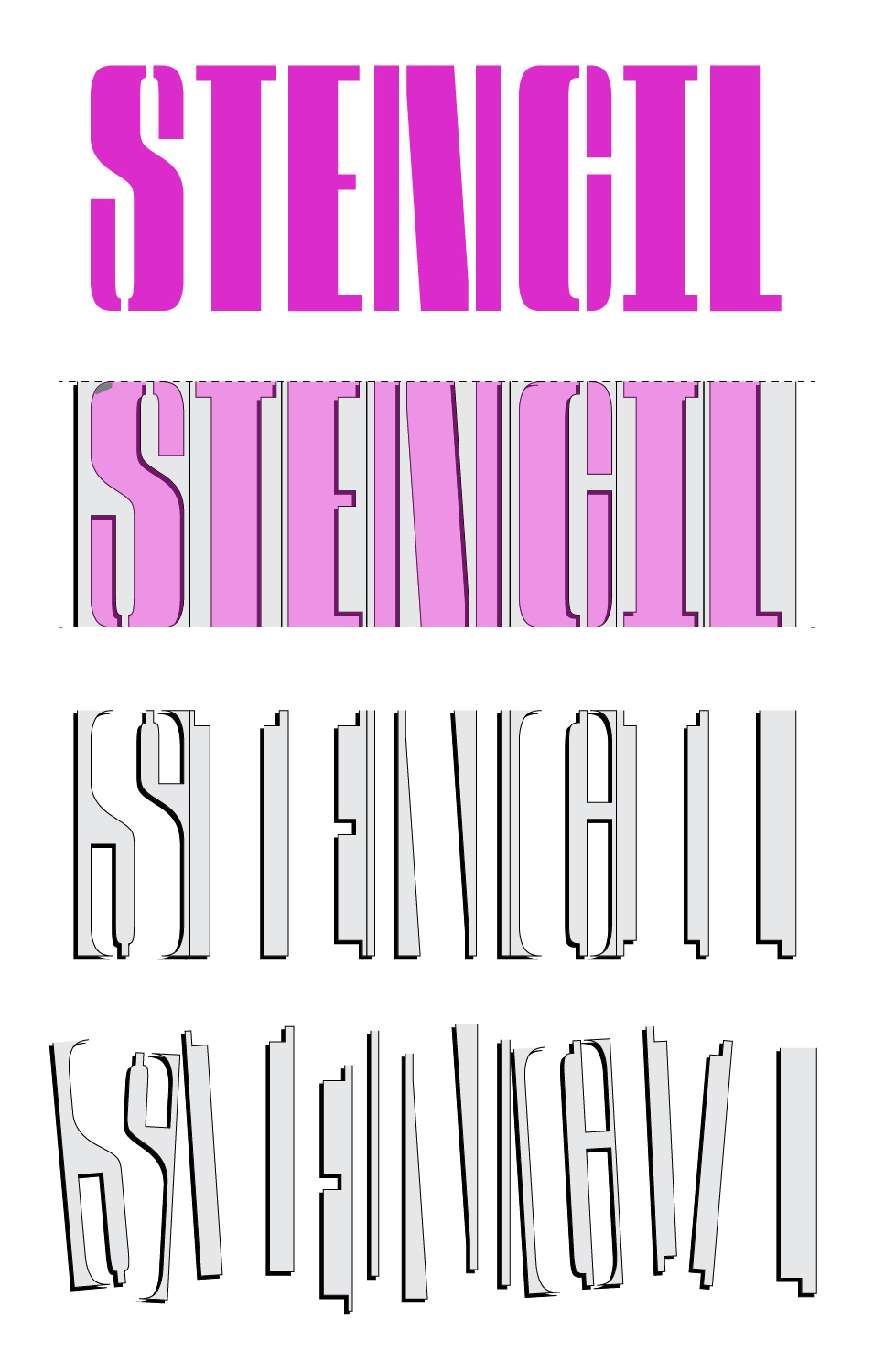
[06] JAB Variable–Stencil Typeface 2023






[07] Concrete–Poetry Animation 2019
[08] Esporo Art–Festival Identity 2022
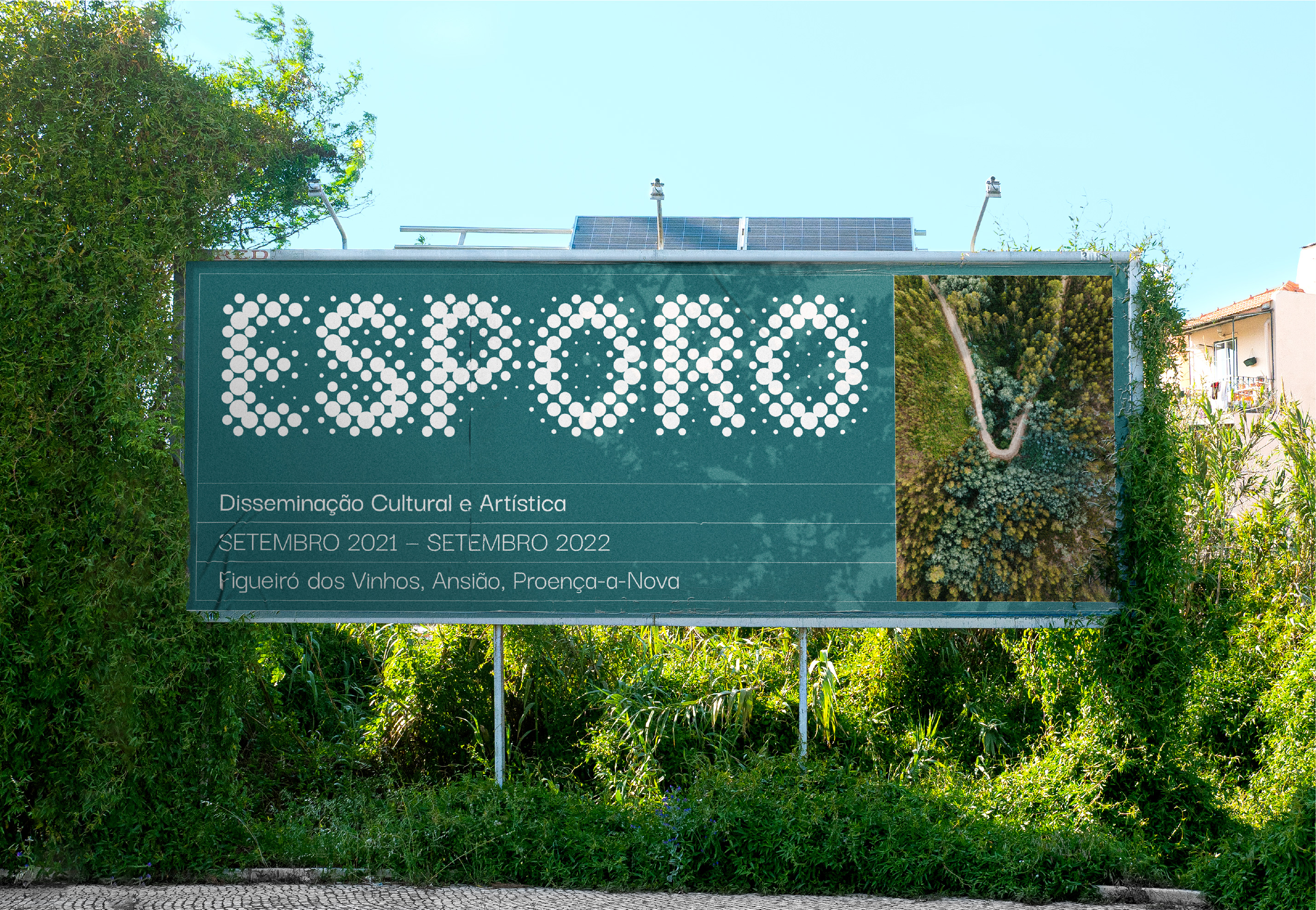


In 2021, I designed, alongside Ana Martins, the first edition of the public art project Esporo, which took place in northern Portugal.
“Esporo” is the Portuguese translation for “Spore”. The starting point was the idea of a seed, something that spreads through nature. Esporo is an artistic and cultural contamination through public installations that change the natural landscape.
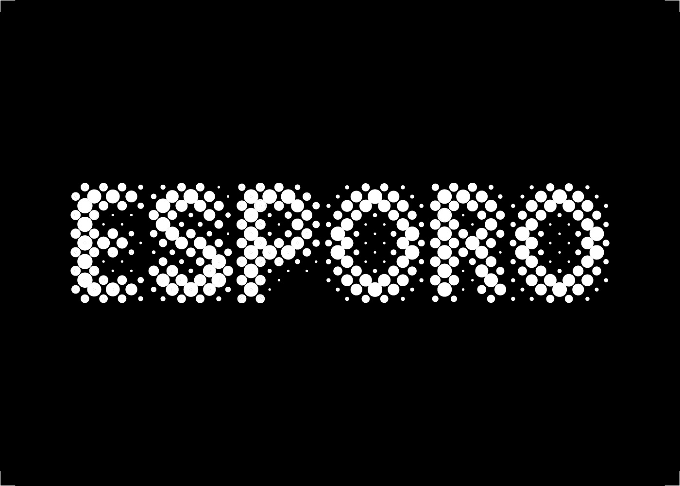
We started our creative process by translating a spore into a graphic form. The result was a group of different-sized circles. From there, we developed a display typeface and a halftone filter to apply to the photos. The result refers to the organic textures that we can find in nature.
We’ve created the entire visual identity, including the templates for the digital materials and every graphic object we present here. An external graphic team took care of the production.
Collaboration: Ana Martins
Photographer: Rui Gaiola


[09] Quadrilátero–Cultural Identity 2022


Quadrilátero is a project that promotes and enhances the cultural and natural heritage of the region of Barcelos, Braga, Famalicão, and Guimarães through an artistic network and cultural programming actions.
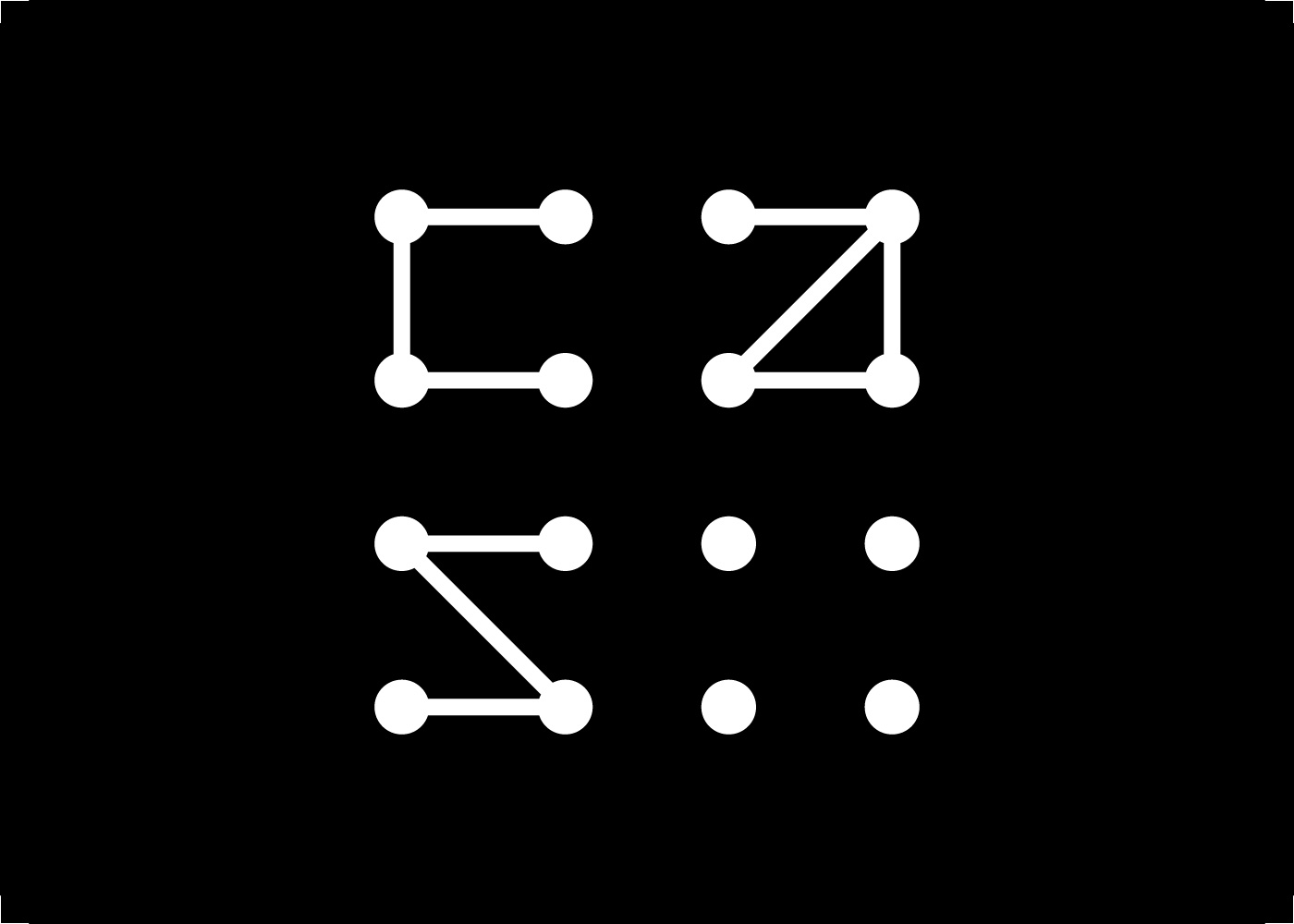
The identity of this project started with the idea of 4 points that, when connected, form a solid structure capable of transforming thue space within. From that structure, we created a logo system with multiple shapes and colours, reinforcing the dynamics of the project — in constant change, demanding a significant capacity for adaptation while never losing its identity.
For the visual communication, we collaborated with the photographer Mariana Vasconcelos who captured the historical places where the events took place. We highlighted the aesthetics of each city by isolating architectural details, that show up masked off by the quadrilateral shapes. The actual layout grids for the posters change with each shape.
Collaboration: Ana Martins
Photographer: Mariana Vasconcelos
[10] Cas–Studio Identity 2017


Cas Studio is a collective for sustainable architecture founded by Alina Jeronimo and Paulo Carneiro. The studio follows a strategy towards sustainability: a balance of social, cultural, environmental and economic factors in the design process. CAS produces different kinds of work, whether furniture, manifestos or housing projects.
To develop their identity, me and Ana Martins, created a simple grided structure where we could build the logo on. The idea came from a very low-tech hands-on approach with the construction materials lying around in the studio. In an attempt to follow the studio perspective, we proposed a logo system that would change and vary, much like the raw materials used by the studio.
Special care was taken when choosing the paper and supplies for stationery and printed materials. As everything needed to be eco-friendly, all the papers were recycled or reused. Another material very present in the studio’s work is wood, so we saw it as a challenge to explore. We made a custom wooden sign for the front door and even an envelope in a thin veneer.
Collaboration: Ana Martins

[11] NAPA Band LOGO 2023

by Anastasiya Yakovets

by Anastasiya Yakovets


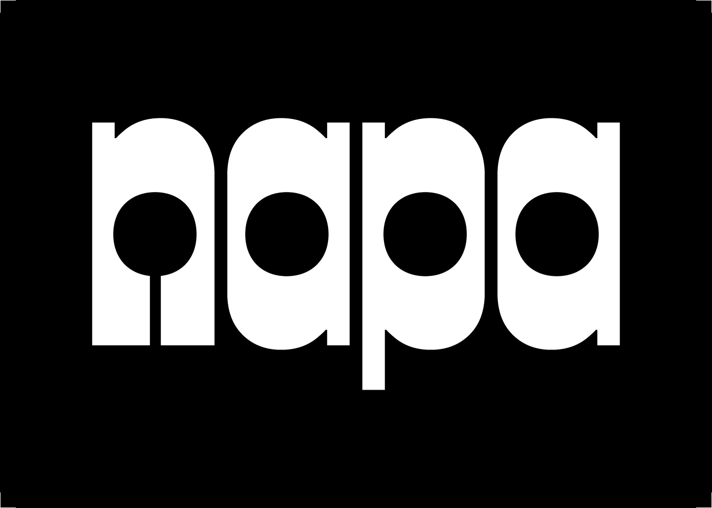
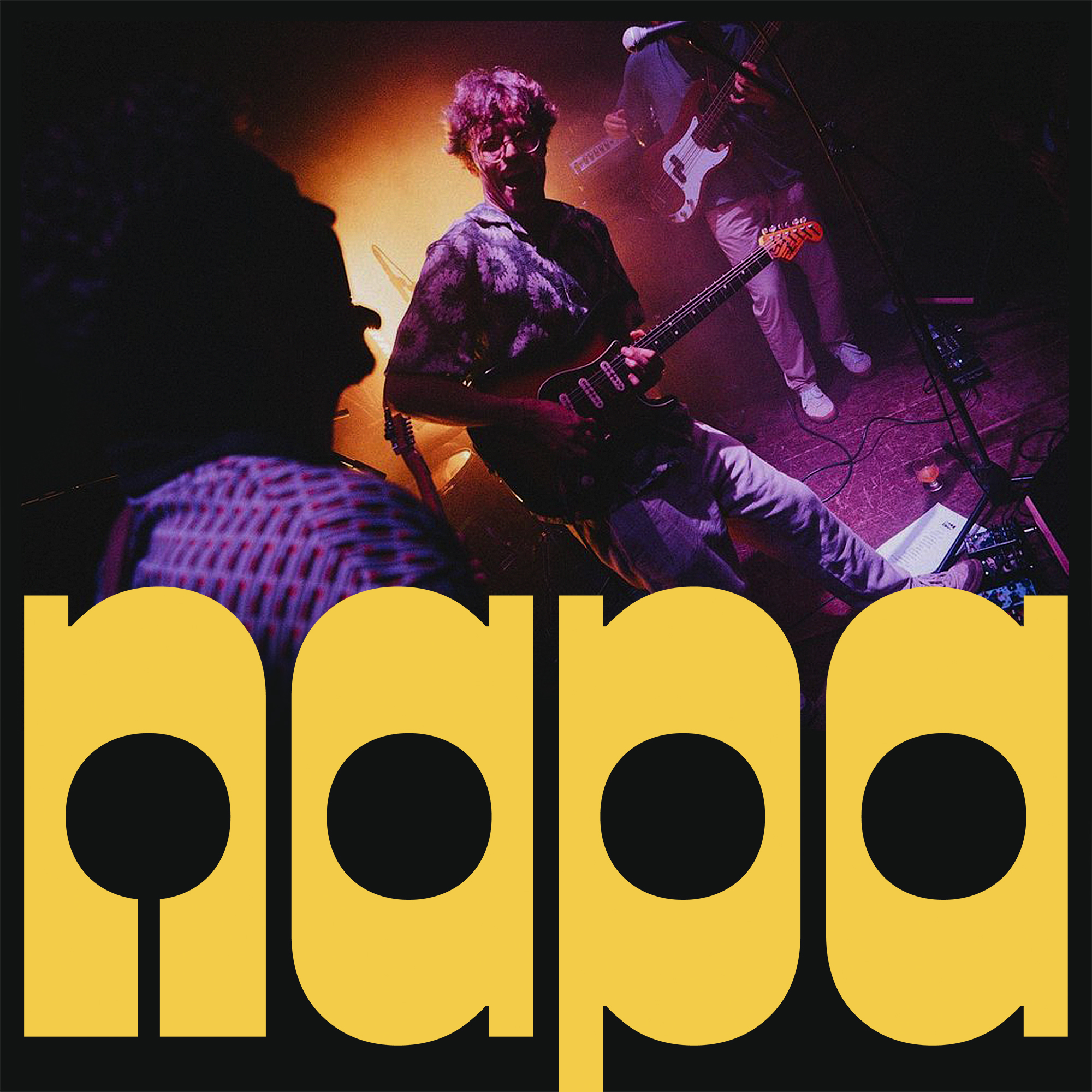
I was so happy when the band NAPA (fka men on the couch) reached out in early 2023 for a new logo. I’ve listened to their music for years and apparently, they have mutually followed my work. In truth, it wasn’t luck that brought us together but someone who put a special good word long long ago!
It was interesting to draw a logo based on the sound and a vibe rather than on a specific communication goal. I showed all my design process with the band, and the final result resonated more with them.
As a final reward, I had the pleasure of listening to them play for a full house at Musicbox Lisboa. My heart was full while listening to the old and new songs and seeing my lettering in the background. Proud of you guys!

by Vera Sottomayor
[12] Scrawling–&–Scrolling MA–Thesis 2020

COVER


Calligraphy is changing its form in the twenty-first century, and it is an urgent matter to understand where it’s headed. It’s essential to understand its history and where it is coming from, bearing a fresh contemporary perspective.
The introduction of technology produces a shift in the goal of writing by hand. It is no longer the most useful or effective manner to write, so it develops in the opposite direction. Calligraphy emerges as an art form and expressive practice. Modern calligraphy differentiates itself by leaving the crystal goblet metaphor and embracing an artistic point of view. Letterforms can be containers of content by their meaning but also their form.
A few questions arise:
What makes calligraphy a relevant study in a time when most words are typed on keyboards? What is the calligraphic reaction to vector? Why is handwriting disappearing from the school curriculums? What are its uses in the 21st century? Where does digital calligraphy stand?

Graphic & Type Design
In this half of my portfolio, you will discover sharp-cut letters, bold graphics, and carefully crafted visuals. While doing my MA at ÉCAL, I learned how to approach the technical process of type design creatively. Flip to the other side of this website to find an experimental space full of colors and giant letters.


[01] Hoopers–Collection Clothing–Design 2022


Clothing line design for the 2022 summer launch of Hoopers PT.
I was challenged to design some very bold typographic compositions with basketball slang and sayings.
Starting from scratch, I first designed a custom display typeface. Inspired by a literal basketball ball, I like the contrast between straight lines and round curves. The letters are condensed to express the vertical movement of the sport also increased by the high middle bar. I design two masters to make some width adjustments possible.
The compositions were designed by only cutting, switching, and moving the type around in two dimensions. The lettering pieces are very graphic and mix the movement in sports with streetwear.
Photos by: Chris Costa
[02] WOOL Art–Festival Identity 2022


For the 10th edition of WOOL Covilhã Arte Urbana, the oldest urban art festival in Portugal, I had the opportunity to develop its identity together with Ana Martins.
We aimed to dig up photos of the works in progress that took over the last few years and treat them with some overlaid gradients. The vibrant colors referred to the artworks of the festival but also the topographic and weather maps, characteristic of the mountains where WOOL happens.
The glitched box layouts came up while thinking about the festival's archive, imagining that the "info" would be displayed on different pop-up windows, and old data would be glitched out.
[03] Klinger–Type Type–Design 2020


This sharp serif style surprised me for its unique singularities and details. It had a distinctive, aggressive feeling while at the same time, a steady and very geometric sense. I developed this source with a revival exercise guided by François Rapppo at Écal Master Type Design.
The original designer was Julius Klinger, an Austrian graphic and type designer. He witnessed the Vienna Secession, and the Jugendstil marked his work. Klinger Type is, at the same time, a stylistic and rational approach. The symmetry and geometric curves contrast the overly-designed serifs, terminals and distinctive details.


[04] 36–Days–Of–Type 2022


This mixed and matched alphabet is the result of a couple of fun days drawing letters and glueing posters around the streets of Lisbon. Made together with Francisco Lacerda, this was our participation in 36 Days Of Type.
Collaboration: Francisco Lacerda
[05] No–Walls Art–Festival Identity 2021


“NO WALLS” is a street art festival that took place in Oeiras, Portugal. During the festival, the artists were challenged to question the field of action of their artistic practice and the limits of urban art. Additionally, there were literally no walls, unlike the “regular” street art, the interventions were all created in tridimensional structures.
For its visual identity, we developed a logo that intends to transmit this concept of total freedom. The letters that make up the logo are not fixed to any baseline or box, they float (within a variable grid) creating different interpretations of the logo.
We decided to extend the basic concept of the logo to the remaining graphic pieces by reinforcing the dynamic, lightness and transparency. To express this, we created an abstract background with organic blurred shapes and warm colors that complement the typographic compositions.
Collaboration: Ana Martins
[06] No–Walls Art–Festival Identity 2021


[07] Concrete–Poetry Animation 2019
[08] Esporo Art–Festival Identity 2022


In 2021, I designed, alongside Ana Martins, the first edition of the public art project Esporo, which took place in northern Portugal.
“Esporo” is the Portuguese translation for “Spore”.
The starting point was the idea of a seed, something that spreads through nature. Esporo is an artistic and cultural contamination through public installations that change the natural landscape.
We started our creative process by translating a spore into a graphic form. The result was a group of different-sized circles. From there, we developed a display typeface and a halftone filter to apply to the photos. The result refers to the organic textures that we can find in nature.
We’ve created the entire visual identity, including the templates for the digital materials and every graphic object we present here. An external graphic team took care of the production.
Collaboration: Ana Martins
Photographer: Rui Gaiola
[09] Quadrilátero–Cultural Identity 2022


Quadrilátero is a project that promotes and enhances the cultural and natural heritage of the region of Barcelos, Braga, Famalicão, and Guimarães through an artistic network and cultural programming actions.
The identity of this project started with the idea of 4 points that, when connected, form a solid structure capable of transforming thue space within. From that structure, we created a logo system with multiple shapes and colours, reinforcing the dynamics of the project — in constant change, demanding a significant capacity for adaptation while never losing its identity.
For the visual communication, we collaborated with the photographer Mariana Vasconcelos who captured the historical places where the events took place. We highlighted the aesthetics of each city by isolating architectural details, that show up masked off by the quadrilateral shapes. The actual layout grids for the posters change with each shape.
Collaboration: Ana Martins
Photographer: Mariana Vasconcelos
[10] Cas–Studio Identity 2017


Cas Studio is a collective for sustainable architecture founded by Alina Jeronimo and Paulo Carneiro. The studio follows a strategy towards sustainability: a balance of social, cultural, environmental and economic factors in the design process. CAS produces different kinds of work, whether furniture, manifestos or housing projects.
To develop their identity, me and Ana Martins, created a simple grided structure where we could build the logo on. The idea came from a very low-tech hands-on approach with the construction materials lying around in the studio. In an attempt to follow the studio perspective, we proposed a logo system that would change and vary, much like the raw materials used by the studio.
Special care was taken when choosing the paper and supplies for stationery and printed materials. As everything needed to be eco-friendly, all the papers were recycled or reused. Another material very present in the studio’s work is wood, so we saw it as a challenge to explore. We made a custom wooden sign for the front door and even an envelope in a thin veneer.
Collaboration: Ana Martins
[11] NAPA Band LOGO 2023


I was so happy when the band NAPA (fka men on the couch) reached out in early 2023 for a new logo. I’ve listened to their music for years and apparently, they have mutually followed my work. In truth, it wasn’t luck that brought us together but someone who put a special good word long long ago!
It was interesting to draw a logo based on the sound and a vibe rather than on a specific communication goal. I showed all my design process with the band, and the final result resonated more with them.
As a final reward, I had the pleasure of listening to them play for a full house at Musicbox Lisboa. My heart was full while listening to the old and new songs and seeing my lettering in the background. Proud of you guys!
[12] Scrawling–&–Scrolling MA–Thesis 2020

COVER


Calligraphy is changing its form in the twenty-first century, and it is an urgent matter to understand where it’s headed. It’s essential to understand its history and where it is coming from, bearing a fresh contemporary perspective.
The introduction of technology produces a shift in the goal of writing by hand. It is no longer the most useful or effective manner to write, so it develops in the opposite direction. Calligraphy emerges as an art form and expressive practice. Modern calligraphy differentiates itself by leaving the crystal goblet metaphor and embracing an artistic point of view. Letterforms can be containers of content by their meaning but also their form.
A few questions arise:
What makes calligraphy a relevant study in a time when most words are typed on keyboards? What is the calligraphic reaction to vector? Why is handwriting disappearing from the school curriculums? What are its uses in the 21st century? Where does digital calligraphy stand?

João Varela, 2024
©
Back Up ↑

João Varela, 2024
©
